
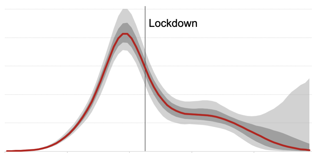
When lockdown was first imposed, there was little science to base it on. The virus was assumed to be growing at an exponential rate, with each infected person passing it on to about four others. The controversial assumption: only mandatory lockdown could stop this. Graphs were drawn, showing the infection rate barely dented by voluntary measures (like handwashing, keeping socially distanced etc.) but lockdown making things safe instantly. Imperial College’s cliff-edge graph had huge traction (the below is a BBC reproduction) and made an open-and-shut case for lockdown.
The above assumptions were the basis of a recent Sunday Times investigation entitled ‘UK’s lockdown dithering led to worst death toll in Europe.’
This was largely based on guesswork but there was – at the time – no real alternative. There is now. We now know enough about the virus to look at hospital figures and work backwards, drawing a chart of its likely infection rate. These tend to draw a different shape: the infection rate rising, hitting a peak, then falling fast. But what makes it fall? Lockdown – or something else? Norway found that the virus had peaked before lockdown and was in fast decline. This led the Norwegian public health chief to say that they could have controlled it without locking down – relying, instead, on the social distancing going on at the time. This is relevant, the Norwegians say, because if there is a second wave we need to be brutally honest about what works and what does not.
Now, a version of this study for England and Wales has been done by Simon Wood, a professor at Bristol University. The study is here (pdf`) and main graph is below.
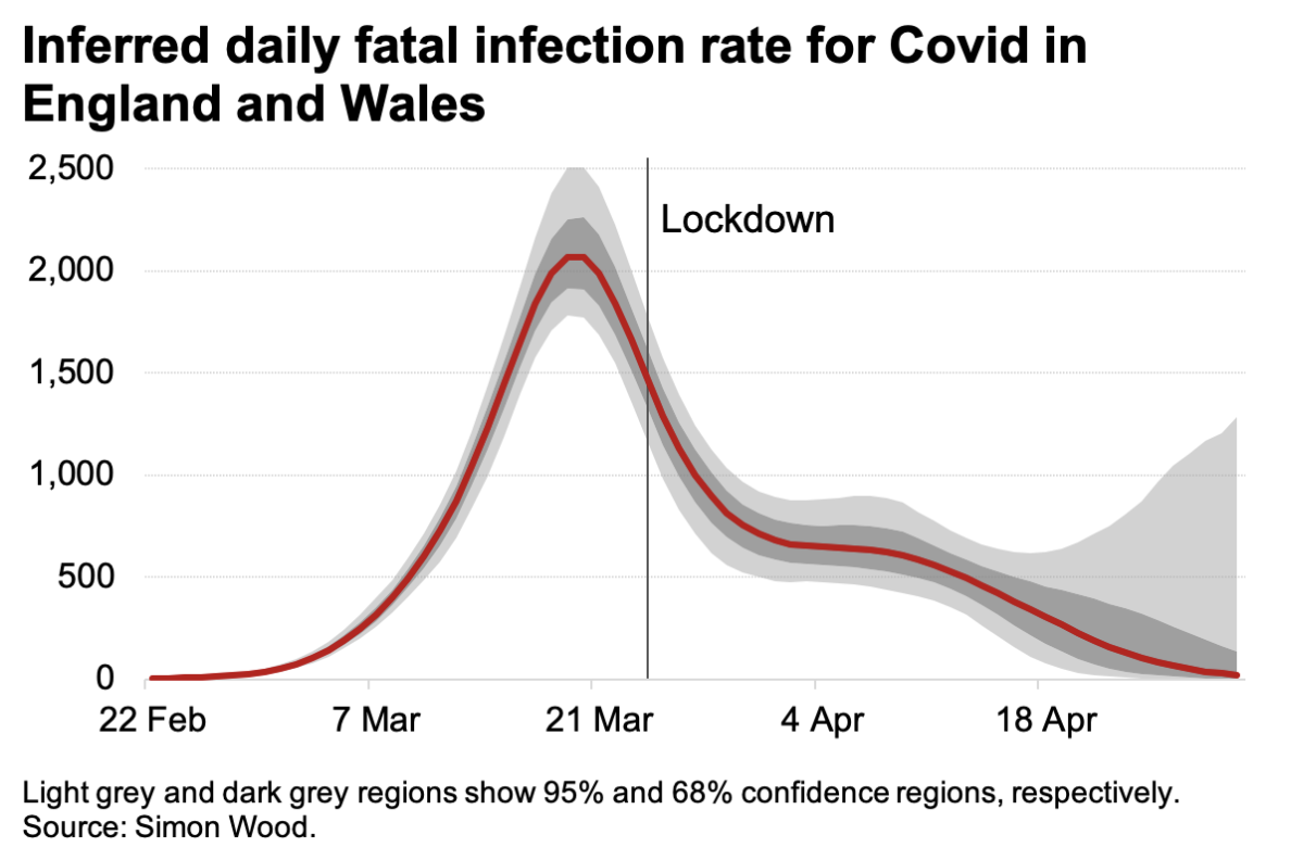
It shows that infections peaked about five days before lockdown and were in fast decline by the time it was introduced. Several social distancing measures were already in place by then – but all on a voluntary, rather than compulsory basis. ‘It is suggestive that pre-lockdown social distancing may have been sufficient for the fatal infections to have started declining in England and Wales some time before lockdown,’ Prof. Wood tells me. This does not say that lockdown was pointless: the decline in infections might have been far less steep without it.
Prof. Wood’s study is presented with the usual health warnings: it is an extrapolation from hospital death data and makes several assumptions: particularly about the distribution of time from infection to death. There are plenty of other factors. For example, if our ability to treat Covid had rapidly improved, that would change things – as the decline in deaths would reflect improved treatment, rather than earlier reductions in the number of infections. But there have, alas, been no such improvements reported.
But the wider question is a simple one: what forced the virus into reverse in Britain? Prof. Wood’s study strongly suggests that it was not lockdown. It’s a valuable contribution to the debate on whether voluntary measures would have been enough and whether the decline of the virus would have happened anyway.


Comments