Design

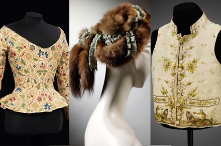
There’s something about Mary

I think I probably qualify as the oldest fashion editor in the world, because in spite of my advanced age I am still writing about clothes (in the Oldie). This gives me one USP: it means that I was actually around — even wearing them myself — when the revolutionary fashion ideas that are now the stuff of museum exhibitions were being invented. Next month the Mary Quant exhibition opens at the V&A, and sure enough I have been asked to talk about those giddy times for a video that will be shown at the museum. I was 16 in the autumn of 1955 when Quant’s shop, Bazaar, first shocked

Maps of the mind

MacDonald ‘Max’ Gill (1884–1947) is less well known than his notorious brother, Eric. But was he less of a designer, less of an artist? The son of a Brighton clergyman, his career was built on a sequence of remarkable connections. The architect Halsey Ricardo, a descendant of the economist, was his tutor. While working for church builders Nicholson and Corlette, Gill very likely met Edwin Lutyens at the Art Workers’ Guild. And for Nashdom, the neo-Georgian house Lutyens built in 1909 for Prince Dolgorouki at Burnham in Buckinghamshire, Gill drew an imaginative ‘Wind Map’. Somewhere between illustration and cartography, this was a pointer of what was soon to come from

Moderne times

On 10 September 1973 the 1930s Kensington High Street department store formerly known as Derry & Toms reopened as Big Biba. It sold the dress designer Barbara Hulanicki’s distinctive look in furniture, paints and wallpaper, sports equipment and food, as well as her familiar fast fashion. If you had to define that aesthetic then, you’d have said it was campy and kitschy. But above all you’d have said it was deco, an increasingly familiar word for the between-wars moderne style in everything from buildings to jewellery. Derry & Toms itself was a 1933 moderne temple of commerce, slathered in stylised ironwork and bas-reliefs. It had a ‘Rainbow Room’ upstairs, which

Hidden treasure | 30 August 2018

In 1675 Lady Bedingfield wrote to Robert Paston, first Earl of Yarmouth. Never, she exclaimed, had she seen anything so fine as the latter’s mansion, Oxnead Hall. It was ‘a terrestriall paradise’, the ‘gardens so sweet — so full of flowers’, the house so clean. ‘Nor,’ she concluded, ‘did I ever in my life find anything in poetry or painting half so fine.’ Almost all this splendour vanished long ago. But its essence survives, compressed into a single painting, ‘The Paston Treasure’, currently the centrepiece of an exhibition at Norwich Castle Museum. It is a cornucopia of baroque bric-à-brac, crammed with a jumbled abundance in which curvilinear tropical shells, ornate

Searching high and low

In the Moderna Museet in Stockholm there is a sculpture by Katharina Fritsch, which references Chekhov’s famous story ‘Lady with a Dog’. It was part of a Jeff Koons mini-show. At the time (2014), I thought it was by Koons. The postcard disabused me. It shows a woman in unapologetic Barbara Cartland pink, with a parasol, accompanied by a white fighting Pekinese. Both are constructed entirely from shells — she mainly scallop shells, her ample bust the bulging hinge of a clam, her arms fashioned from auger shells like mini-whelks. We have seen this ‘art’ before in a thousand evening classes for housewives who couldn’t get into the over-subscribed flower-arranging

Minor key

‘When I’m on good form,’ Edward Bawden told me, ‘I get to some point in the design and I laugh and talk — and if I’m laughing, it probably means the work is rather good.’ You can see his exuberance everywhere in the exhibition of his work at Dulwich Picture Gallery. It is a thoroughly jolly affair, but it also raises a delicate question: was Bawden (1903–89) really a serious artist? He was certainly a tricky one to pigeon-hole. Bawden is, deservedly, one of the most popular of 20th-century Britishartists. But when one thinks of him, it is hard to bring a major work to mind — much harder than

Call of the wild | 19 April 2018

One of the prettiest pieces in the V&A exhibition Fashioned from Nature is a man’s cream waistcoat, silk and linen, produced in France before the revolution, in the days when men could give women a run for their money in flamboyant dress. It’s embroidered with macaque monkeys of quite extraordinary verisimilitude, with fruit trees sprouting all the way up the buttons. And what we know is that they were derived from the Comte de Buffon’s Histoire Naturelle, générale et particulière, of 1749–88. As Edwina Ehrman, curator of the exhibition, observes in her introductory essay, ‘choosing monkeys from Buffon’s publication… to create an embroidery pattern for a waistcoat reflected the fashionable

Hobbit houses and 3-D homes

Since 2006, someone called Kirsten Dirksen has been posting weekly videos on YouTube about ‘simple living, self-sufficiency, small (and tiny) homes, backyard gardens (and livestock), alternative transport, DIY, craftsmanship and philosophies of life’. But don’t let that put you off. Basically, Dirksen makes short films about people’s quirky homes: ‘Tiny Parisian rooftop terrace transforms for work and leisure’, ‘Extreme transformer home in Hong Kong’, etc. Fear not: this not some shoestring Grand Designs. There is little or no enthusing, there are no vacuous summings-up, there is no false jeopardy. The videos vary in length: some of them last for less than ten minutes, others for close to an hour. Many

Sea fever

Looking at the sketchbook of William Whitelock Lloyd, a soldier-artist who joined a P&O liner after surviving the Anglo-Zulu War, I’m reminded why I avoid cruises. On board this India-bound ship were: a ‘man who talks a great deal of yachting shop and collapses at the first breeze of wind’, ‘a successful Colonist’, and ‘the victim of mal de mer who lives on smelling salts’. It would be just my luck to be stuck in the cabin between ‘One of our Flirts’, the busty lady with pretty eyes, and what Lloyd affectionately called ‘Our Foghorns (automatic)’ — two bawling babies. By the late 19th century, ocean liners attracted all sorts,

Ferrari – heavy, expensive, wasteful, dangerous and addictive

Has a more beautiful machine in all of mankind’s fretful material endeavours ever been made than a ’60 Ferrari 250 Granturismo? Go to the Design Museum and decide. I have driven many Ferraris and the experience is always unique. They are alive, demanding, feral, sometimes even violent or truculent. Addictive, too. Once, in Haverfordwest, I arrived sweating and puffing after seven hours in traffic. I parked the 246 GT at the hotel for a moment but then, unable to ignore the hot, seductive car, I got back in and drove up and down the coast road; up and down, up and down. Just because it was there. Kierkegaard thought that

Design for the disabled and you can’t go wrong

About 30 years ago, BT introduced a telephone handset with enormous keys. It was intended for people with serious visual impairment. Unexpectedly, it became their bestselling phone. There is a reason for this. The millions of people who wear spectacles or contact lenses typically remove them at night, making the normal tiny keys impossible to read on a bedside phone. Things designed specifically for people with disabilities often end up being valuable to many more people than originally planned. Most of us are effectively disabled some of the time. Wheelchair ramps at airports and stations are not only useful if you are in a wheelchair, they are also useful for

Cold comfort | 7 December 2017

Mrs Thatcher once explained that she adored cleaning the fridge because, in a complicated life, it was one of the few tasks she could begin and end to total satisfaction. In this way are refrigerators evidence of our struggles, our hopes and our fears. Moreover, if you accept that the selection and preparation of food is a defining part of our culture, then you must acknowledge the primacy of the refrigerator in human affairs. In 2012, The Royal Society declared refrigeration to be the single most significant innovation in food technology since Fred Flintstone invented the barbecue. Me? I wrote these notes while chewing chilled sapphire grapes from Brazil, via

The female gaze | 2 November 2017

Every weekday, I travel by Tube to The Spectator’s office, staring at the posters plastered all over the walls. I like looking at the plays and exhibitions that have recently opened or wondering whether that shampoo really will add more ‘oomph’ to my hair. Often there is a pretty girl on the poster. A picture of a woman can sell almost anything. I’ve rarely thought much about the individuals who produce the posters. But as a new exhibition at London’s Transport Museum called Poster Girls reveals, there is a rich history of female art running through the city’s concrete veins. For more than 100 years, the transport network has provided

The art of persuasion

It’s hard to admire communist art with an entirely clear conscience. The centenary of the October revolution, which falls this month, marks a national calamity whose casualties are still being counted. When my father-in-law comes to visit, I have to hide my modest collection of Russian propaganda: he grew up under the Soviets and has few fond memories of the experience. He can’t work out why old agitprop is so popular today. But the simple fact is, for all the disaster they wrought, the Bolsheviks did leave a legacy of images so striking that, even now, they can draw thousands into a museum. As Tate Modern is about to demonstrate.

Football focus

The early 1970s was football’s brute era of Passchendaele pitches and Stalingrad tactics. The gnarled ruffians of Leeds United — wee hatchet man Billy Bremner, the graceful assassin Johnny Giles, Norman ‘Bites Yer Legs’ Hunter — embodied the age. Not that you’d guess this from the badge on the club’s shirt: the letters LU were styled into a grinning emoji in goofy yellow. In 1973, the club kit (pristine white, which they had changed to a decade earlier to mimic the lordly Real Madrid) was designed by Admiral, the company that dreamed up the wallet-emptying concept of the replica shirt. Admiral went in for hectic piping and busy collars. They

The old ways

I’m sitting across a café table from a young man with a sheaf of drawings that have an archive look to them but are in fact brand new. His Jacob Rees-Mogg attire — well-cut chalk-stripe suit and immaculate tie — sets him apart from the others in the room, who are mostly architects and architectural fellow travellers like me. We don’t dress like that. But George Saumarez Smith is indeed an architect, a very good one. He just happens to be a trad. A traditionalist, mostly a classicist. And now is very much the time of the architectural trads. They have crept up on us. There’s a revival going on,

Perception vs objective reality

I hate to tell you this, but every time you watch television you are being duped. In fact there are only three accurate things you will ever see on television. These are the colours red, green and blue. Each pixel on a screen can transmit three colours only. If blue alone is illuminated, the screen is blue. And it really is blue. But TV yellow is a big fat lie. It looks yellow. But it isn’t really yellow. It’s a mixture of red and green light which hacks our optical perception so we think we are seeing yellow. That’s because humans, indeed all higher apes, are mostly trichromats. We have

Vital signs

Exhibit A. It is 1958 and you are barrelling down a dual carriageway; the 70 mph limit is still eight years away. The road signs are nearly illegible. You miss your turning, over-correct, hit a tree and die. The following year, graphic designer Margaret Calvert is driving her Porsche 356c along the newly built M1. The motorway signs are hers. It is information design of a high order, possibly even life-saving. The clarity and intelligence of Calvert’s British road signs remain unmatched nearly 60 years later. And the font she created became the NHS, and later rail and airport, standard. Exhibit B. The French are worried about nuclear waste. Given

Frills and furbelows

Over the winter of 1859–60, a handsome young man could be seen patrolling the shores of the Gulf of Messina in a rowing boat, skimming the water’s surface with a net. The net’s fine mesh was not designed for fishing, and the young man was not a Sicilian fisherman. He was the 25-year-old German biologist Ernst Haeckel from Potsdam searching for minute plankton known as Radiolaria. In February he wrote excitedly to his fiancée, Anna Sethe, that he had caught 12 new species in a single day — ‘among them the most charming little creatures’ — and hoped to make it a full century before leaving. Haeckel had a degree

Rory Sutherland

iAddicts

For many years The Spectator employed a television reviewer who did not own a colour television. Now they have decided to go one better and have asked me to write a piece to mark the tenth anniversary of the iPhone. I have never owned an iPhone. (In the metropolitan media world I inhabit, this is tantamount to putting on your CV that you ‘enjoy line dancing, child pornography and collecting Nazi memorabilia’). But, even though I’m a diehard Android fan, I still cannot help paying attention to every single thing Apple does and says. I don’t think this happens in reverse. I doubt Apple owners pay any attention to the