
There have been various style know-it-alls who have been ruminating over the possible, perhaps inevitable, return of suits which have Miami Vice proportions. The Eighties cop show was bold in its broad silhouette, generous pleats, puffy shoulders and unstructured loucheness that undid 100 years of tailoring’s mission to flatter and ennoble. In 2021 it feels like the logical next step for people all too used to not having to dress up at all – an exercise in sartorial fence sitting. What people didn’t predict was that people would also feel inspired by the show’s colour palette too. Pastels are everyone’s favourite tone to mock, but opting for brightness, is the smart move.
I’d like to claim credit for the uprising, having written in 2019 about J.P. Hackett on Savile Row making me an oatmeal fresco wool double-breasted suit, but truth be told others beat me to the punch. Most recently, and said with precisely zero mawkishness, Chadwick Boseman’s Vanity Fair cover was pitch perfect. Style icons over the years have certainly not eschewed pastels, way back to Robert Redford in The Great Gatsby (and the remake) or David Bowie’s pastel blue suit, Bryan Ferry in green, or the Duke of Windsor in corduroy (or cordu-ex-roy). But then it was me and my fresco wool.
Collections are being produced around this growing trend. Ralph Lauren, who have their fingers on countless pulses, have included Hawaiian shirts as part of their Purple Label (the most formal) collection. The increase in Hawaiian shirts in tailoring has a lot to do with the brighter fabrics people are opting for, with patterns providing a balance, turning the volume down, denim shirts do the same. The opposite is true also, where the black tails and grey cashmere-striped trousers of morning dress are given life by pastel waistcoats and you can see these in everyone’s from Gieves & Hawkes and Favourbrook. If you peek into high fashion, Louis Vuitton, Zegna, Berluti have all dedicated some space on the runway to pastels. Great commentators on the subject like Ben Cobb, whose entire existence is shot in seventies sepia, or his good chum Luke Day, neither of whom see pastels as infra dig.
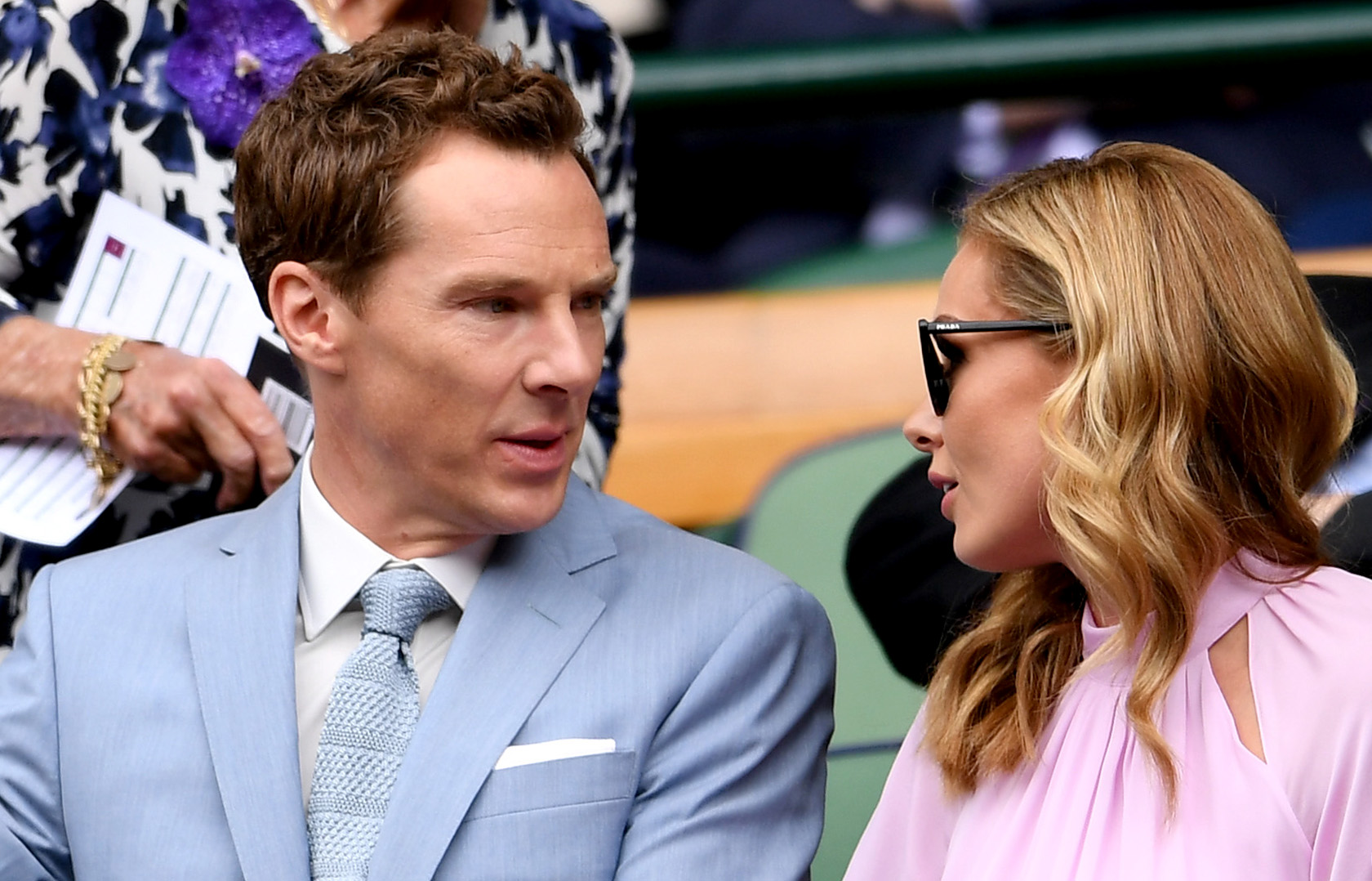
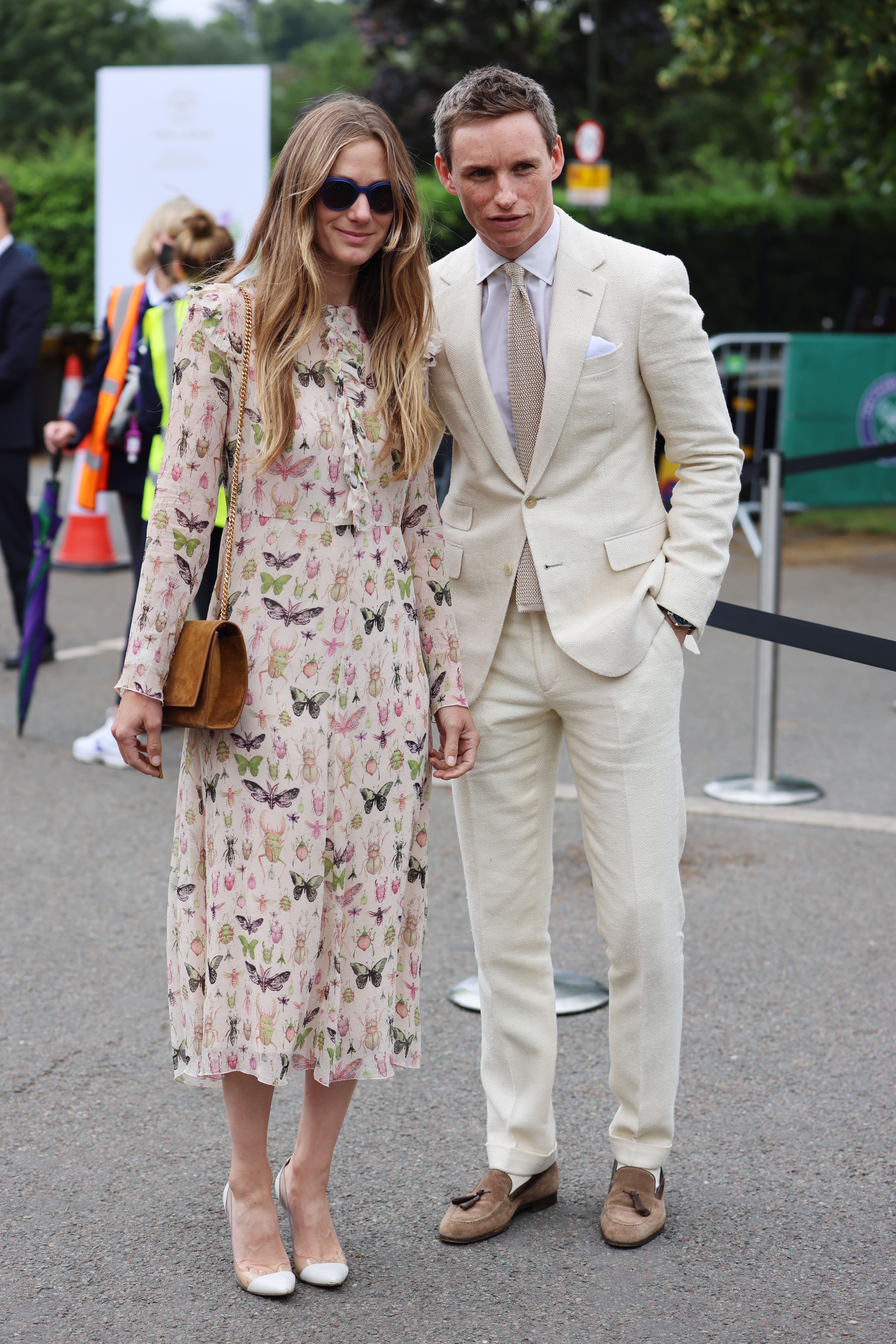
It’s worth noting that bright suits and shiny suits are different. Pastels are powdery, matt, muted but dramatic. Shiny is still pretty horrid, all due respect to Timothee Chalamet who I am yet to understand. His showboating at Cannes in a glistening Tom Ford suit was ghastly. The Italians speak of sprezzatura, an attitude of individuality and effortlessness in one’s dress. The challenge is to do so with something like pastels, you need a confidence that perhaps only Italians and Nick Foulkes has, but when you’re attention-seeking, it doesn’t work. It is much easier for Messrs Cumberbatch and Redmayne, who are dressed by stylists, to feel emboldened to do so.
So, feel empowered to hesitate, and watch it begin to unfold, but be under no doubt that there is an unleashing of colour coming and you’d be wise to nail yours to the mast, and you could do much worse than learn from Don Johnson on how to wear it.


Comments