
In 1915 D.W. Griffith’s Birth of a Nation was premièred, Henry Ford manufactured his millionth Model-T (‘a million of anything is a lot’, he said), Kafka’s Metamorphosis was published and so, too, was one of Einstein’s critical contributions to his own general theory of relativity.
Mixed into this modernist cocktail of extreme achievement and harrowing perceptions was something more banal, but just as enduring: the Coca-Cola ‘contour’ bottle. A century old this year, it is, in a disputed field, an undisputed ‘design classic’. And, like any classic in any genre, it can be read in many ways.
Long before Apple and the Messianic Steve Jobs, Coca-Cola developed a business model that was the proxy of a larger belief system. Selling Coke was structurally identical to religion: in a rootless population of immigrants, the Coca-Cola brand — any brand — offered the comfort of familiarity. There was a liturgy of simple but appealing claims (‘delicious and refreshing’), persuasive iconography in the form of relentless advertising, an articulate priesthood of boosters, a thirsty congregation and …an artefact of faith: the distinctive bottle. Icon is an abused term, but not here.
In 1836 Alexis de Tocqueville, with an old European perspective, marvelled at the mercantile energy of America. ‘It is odd,’ he wrote, ‘to watch with what feverish ardour the Americans pursue prosperity.’ Thirty-eight years later, Sherman burnt Atlanta. As it was being rebuilt, John Stith Pemberton, an itinerant quack with a morphine habit, was dabbling in over-the-counter remedies, snake oil, hair dyes and cordials, hovering at all times between the likelihood of jail or the prospect of great riches.
His Globe Flower Cough Syrup was, for example, not a success, but in 1886 he, by what agency is not known, made a concoction that tasted better than merely medicinal. Intended as a ‘brain tonic’ to alleviate dyspepsia and melancholy, its essential ingredients were the coca leaf and kola nut. This nut was presumed by the rainforest Africans who cultivated it to have a powerful aphrodisiac effect. Since Pemberton’s original formula probably included alcohol, sugar and caffeine as well, its immediate popular appeal is unsurprising. It quickly reached a constituency beyond the dyspeptic and melancholic. His bookkeeper, a man called Robinson, substituted a ‘c’ for a ‘k’ and Coca-Cola was born. Robinson’s handwriting became the cursive trademark.
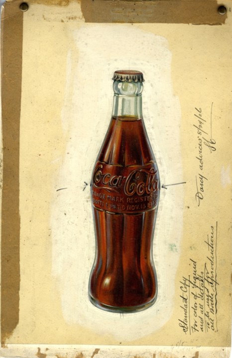
Despite narcotic cocaine residue being chemically removed in 1903, Coca-Cola flourished crazily. At first it was distributed not in recognisable bottles, but as a bulk syrup for its diaspora of bottlers to carbonate. This reduced packaging and distribution costs, but meant no central control over what we now call brand identity. In 1910 one of the bottlers, perhaps creatively inflamed by brain tonic, suggested the need for a single bottle that could be ‘identified in the dark’. Herein a part of any definition of ‘design classic’: an inspired brief.

After consulting illustrations of the kola nut in the Encyclopaedia Britannica, a Swedish engineer called Alex Samuelson, working for the Root Glass Company of Terre Haute, Indiana, designed the famous bottle whose ‘contour’ apes the curves of the nut. And here’s the second part of that classic definition: an ingenious interpretation of a brief. That was in 1915. The design was patented the following year and now Samuelson’s Coca-Cola contour bottle has a reasonable claim to being the most successful manufactured artefact ever.
A third element in the definition of any ‘design classic’ is the way a product acquires meaning. America invented fast food. You eat standing up at counters and bars. The Coca-Cola bottle soon became a part of a national fast-food menu of burgers and dogs, wieners and diners. Significantly, not only can it be recognised in the dark, it can also be held in one hand. European café custom was coffee served in a cup and saucer, requiring dexterity, concentration and a sitting position. A Coke you could drink on the move, at the wheel or on the bleachers. This implied dynamic, and the mobile democracy of consumer pleasure it suggested, became the stuff of the American Dream. And Coke became its single most effective symbol.
Painters soon recognised this. At first they were respectful and appreciative: Norman Rockwell, the Apelles of suburbia, was a consultant creating artwork for ads while Haddon Sundblom — like Samuelson, a Swede — recruited Santa Claus for Coke propaganda. But as Coca-Cola’s global presence increased, so artists became more knowing and ironic. A Coke bottle appears in Salvador Dalí’s painting ‘Poetry in America’ (1943). When in the beige post-war years Britain’s pop artists wanted to evoke exotic transatlantic pleasures, a Coke bottle was reliable shorthand. Eduardo Paolozzi used the motif often.
Robert Rauschenberg’s ‘The Coca-Cola Plan’ (1958) features the bottle and is the most well known of his innovative multimedia ‘Combines’. Then, of course, there was Andy Warhol. To Warhol, the Coca-Cola bottle was what angels were to Fra Angelico, although for different reasons. ‘A Coke is a Coke and no money can get you a better one,’ he said in democratic mode. Warhol’s 1962 ‘Coca-Cola [3]’, his first standalone masterpiece, was sold at Christie’s for $57.2 million in 2013. With nice symmetry it now belongs to Alice Walton, the Walmart heiress whose fortune was made from discount supermarkets.

Designers also co-opted the Coca-Cola bottle. In a famous 1946 interview, Raymond Loewy, the glossy mountebank who created the very first design consultancy in New York in 1927, professed his admiration for the ‘Callipygean curves’ of the contour bottle. The reference is to a classical sculpture in Naples and the Greek means, more or less, ‘shapely bottom’. So maybe there is an occult eroticism here too.
Careless misreading of Loewy’s interview led to a popular assumption (even repeated by Christie’s) that he actually designed the bottle, an impression Loewy never bothered to correct (even if he was actually in the European trenches in 1915). What is certain is that his extraordinary Studebaker Avanti of 1961 featured a curvaceous hip-line that became known as ‘the Coke bottle curve’. It remained, with the Ford Mustang and Chevrolet Camaro, in the US car design repertoire throughout the Sixties and Seventies.

Everyone will make money from Coca-Cola, one of its chairmen once said. Indeed, in 1948 the company was pleased to describe itself as ‘the essence of capitalism’. Coke is a money system as much as a religion, although, as Tocqueville saw and Warhol recognised, perhaps the two cannot be separated in the United States. ‘Buying is much more American than thinking,’ Andy said, adding, ‘I’m as American as they come.’
Coca-Cola was the first company to appreciate the voodoo of ‘brand value’. There is a fascinating calculation that’s easy even for the financially illiterate. You look at the Coca-Cola Company’s market capitalisation, which is about $170 billion. Then you subtract its very much smaller tangible assets. The vast sum left is the cash value of the brand that Alex Samuelson’s 1915 bottle did so much to create. So here’s another part of the ‘design classic’ definition: commercial success.
The bright American Dream is now tarnished: industrial champions General Motors and IBM are lacklustre names suggesting neither prosperity nor progress. Changing attitudes to America may also be inferred from treatments of Coca-Cola. In 1960, Ely Jacques Kahn, a witty New Yorker writer published The Big Drink, a corporate history written in thrall to creation myths, heroic ideas of commercial genius and, withal, a sense of wonder about the glory of being American.
This year Bartow J. Elmore, an environmental historian, has published Citizen Coke. Here he describes Coca-Cola’s domination and manipulation of global sugar and caffeine markets, its cynical bullying of governments to get access to clean water (79 billion gallons last year) at low or no cost. Moreover, in the Sixties Coca-Cola moved away from reusable glass bottles to more economical ‘one-way’ packaging in throw-away aluminium cans. This saved on diesel, but created mountains of waste: the American Dream left a nasty stain.
No amount of aspartame or fructose can sweeten the taste of an American Empire gone sour, no amount of fizz can brighten a national vista of lost promise. Today Coca-Cola has critics who see a purveyor of obesity products to a credulous global underclass, not a universal symbol of American delight. Warhol was asked what Coca-Cola meant to him. Succinctly, he answered ‘Pop’. Looking back, how evanescent that sounds. The bottle, however, remains. Reputations may come and go, but classics never die.


Comments