
The Transport Secretary, Heidi Alexander, has revealed new train designs for the nationalised Great British Railways. By next spring, a train looking like a nursery school project will be arriving at a station near you.
According to Alexander, the Union Jack-based design supposedly ‘represents a new railway, casting off the frustrations of the past and focused entirely on delivering a proper public service for passengers.’ As far as its appearance is concerned, it would have been better if it was not so much on time, as cancelled entirely.
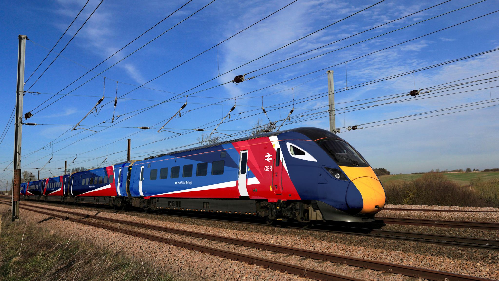
The design is an advertisement of failure
The physicist Wolfgang Pauli once rejected a student’s thesis, saying ‘It’s not even wrong’. He meant that to be wrong would at least put it in the proximate region of being right. That’s not the case here. No revisions or refinements can save the new GBR livery. It is a mad dog’s breakfast – a feeble, third-rate exercise in pseudo branding. We will be committed to suffering this visual mess for a long time to come.
Everything that is made reveals the beliefs and preoccupations of the people who made it. So it is fair to assume that this atrocious design accurately reveals underlying problems in the organisation that allowed such a vulgar transgression to occur. It projects the values of the sponsoring organisation: artless, careless, clumsy, unintelligent and uncoordinated.
Let’s start with the name. Great British Railways has wince-making cuteness. The nation that invented rail travel doesn’t need to blow its own klaxon in such an embarrassing and apologetic way – unless the enfeeblement of national purpose was an element of the creative brief. It’s like wanting to be cool: just wanting it denies the possibility of it ever happening.

The livery is, to flatter it or a moment, a deconstructed Union Jack. Or, more honestly, an infantilised travesty of a bold national symbol. This version of patriotism is the last refuge of the incompetent and clueless.
The designers have incorporated Milner Gray’s 1965 British Rail double-arrow logo (a clever, timeless device). But here it is humiliatingly subjugated to an infantile splash of banana republic flag-waving. It is a chastening reminder of how far our pride and confidence have fallen. How did this happen?
The Department for Transport says the new livery was created ‘in house’. This seems to me like asking a graphic designer to run a railway. Why did they do this when Britain has a super-abundance of private sector design talent that can stand comparison with any other country? They would not have had to look far – this is a job any top designer would have wanted.
Is this really the best the department could do? If so the future of GBR looks bleak. The design is an advertisement of failure. It shows a lack of imagination and vision: it is an explicit rejection of excellence. In the competitive private sector, branding establishes points of difference. No one wants to copy Primark, but quite a lot of people want to copy Prada. GBR has no competition. Why not, then, make it outrageously superb?
For purposes of comparison, did anyone look at Japan’s Shinkansen? That’s how a train should be: exciting and flamboyantly understated. Or Italy’s Frecciarossa, which is as stylish as Milan’s via Manzoni. Deutsche Bahn has its own problems but at least the monochrome livery of the German trains exudes technocratic confidence (which is actually missing, as travellers to Frankfurt will know).
The new GBR livery is playschool-level creativity, although saying that brings bright children into disrepute. It speaks volumes about the functional dimness and arrogant lack of taste of DfT decision-makers. We should feel loss about this national disgrace because it could and should have been so very much better.
Let me tell you what good graphic design can achieve, and how it can create pride and excitement. In New York’s darkest days, mayor Ed Koch asked Milton Glaser to design a unifying motif to capture the values of the city. Glaser, a genius of graphic design, created the famous ‘I HEART NY’ which – along with the Christian cross, Islamic crescent, Nike swoosh and Coke bottle – is one of the all-time great exercises in branding. It lifted the spirit of an entire city and continues to do so 50 years later.
That was the opportunity here. And it is clearly an opportunity that has been ignored. Everyone knows the UK’s railways are stuck in Miltonic chaos. No one thinks that a slick paintjob alone would improve efficiency and enhance customer satisfaction or make the trains run on time. But it would have helped. Style is not the feather in the cap, but the feather that makes the arrow – or railway locomotive – fly straight.
If this travesty was created ‘in house’, it’s a house which badly needs sorting out


Comments