
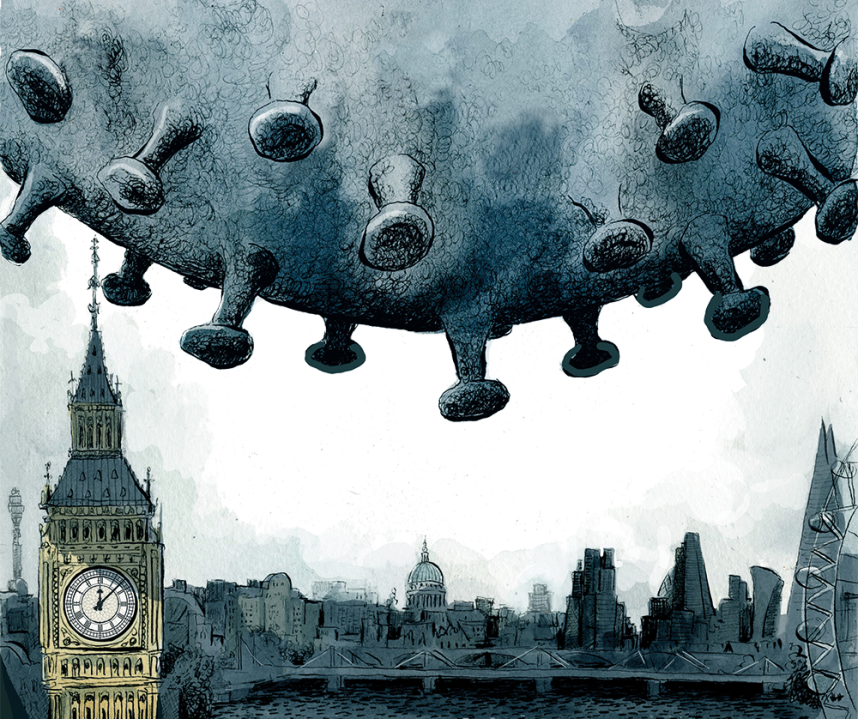
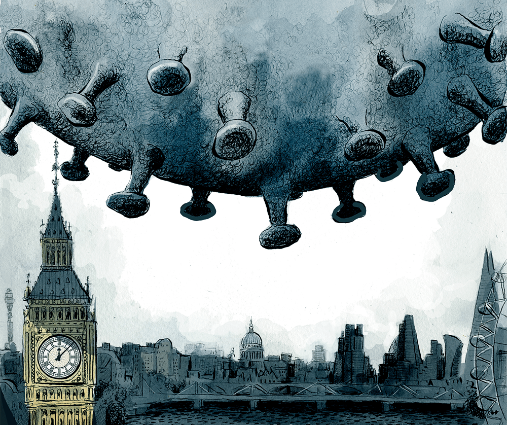
What will the new map of tiers look like when England exits lockdown next week? It certainly won’t be the same system we left behind when we went into lockdown on 5 November. For one thing, we have been told that restrictions are tightening and that more areas will be shunted into Tier 3.
The epicentres of new infections at the moment are not as much in the cities as relatively low-income suburban and semi-rural areas in Lincolnshire and North Kent. Swale (528 new infections per 100,000), East Lindsey (467) and Boston (433) currently top the infection charts. Liverpool by contrast — the first place to go into Tier 3 — can now make the case that it should be the first place to come out of it: infections are down to 173. The Prime Minister yesterday claimed that his community testing was contributing to the fall — although rates were falling sharply in the city before it started.
One of the government’s trickiest political decisions will be what to do about London, where there are wide variations in the infection rate, from 354 per 100,000 in Havering to 97 in Camden. Could London be split, as some have suggested, with restrictions decided on a borough-by-borough basis?
There are two serious problems with this. Firstly, borough boundaries are largely invisible and wind intimately through residential areas. It would be very easy to end up with a situation where a group of six people walking down the street (okay in a Tier 2 area) could suddenly become an illegal gathering as they crossed, unknowingly, into a Tier 3 borough. We will certainly have the bizarre sight of pubs and restaurants open on one side of a street (okay in Tier 2 areas) but closed on the other.
The other problem is political. The boroughs with the lowest rate of infection tend to be those in central London and in some of the wealthier suburbs. It would look all too much like the rich and powerful gaining themselves a little freedom while the less well-off were kept in the deep freeze.


Comments