This exhibition was dreamt up by David Boyd Haycock, a freelance writer and curator, following the success of a book he published with a similar title in 2009. The Crisis of Brilliance book focused on the early career of five Slade-trained artists and their relationship with the first world war. When I reviewed it at the time, I felt that Dr Haycock was simply retreading rather familiar ground, however agreeable his text, as all of the artists he chose to highlight had already been extensively written about. To the five artists of the book a sixth has been added for the exhibition: David Bomberg. This enables the show to include two large canvases by Bomberg that contribute considerably to the impressiveness of the display. Although I enjoyed Dr Haycock’s book, well written and researched as it undoubtedly is, his thesis works even better as a mixed exhibition. This show certainly makes the trek out to Dulwich worthwhile.
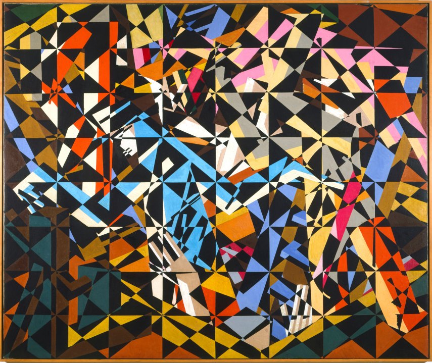
Outside the temporary exhibition space, in the main hall of the museum, currently hangs Bomberg’s great painting ‘In the Hold’ (c.1913–4), a vast gridded canvas diagonally subdivided. It looks totally abstract, and several contemporary critics thought it resembled a design for linoleum or a silk shawl rather than a figurative painting. Yet Bomberg insisted that it depicted ‘some men emerging from one trapdoor and entering another in the hold of a ship’, a subject close to the heart of the Jewish community in England, as most refugees arrived here in this way. Difficult to read or decode, this painting should perhaps have the preparatory drawing for it hung alongside, as this makes the abstracted structures of the composition much more decipherable. Instead the viewer is immersed in a kind of visual music, fractured and rhythmic, alternately jarring and harmonious, full of coloured facets from puce to icy blue, a whirling ordered confusion, which sets up certain expectations. The exhibition, of which this is the prelude, is by no means so consistently radical.
In the first room, a group portrait by John Currie depicts two of the show’s protagonists — Mark Gertler and C.R.W. Nevinson — along with the artist himself, Edward Wadsworth and Adrian Allinson. A series of further portraits and self-portraits introduces the other featured artists: Stanley Spencer, Bomberg and Dora Carrington, though with only an early and untypical Blakean drawing to represent Paul Nash. There are three really beautiful paintings here: two by Spencer, his remarkable ‘Nativity’ and the jewelled ‘Two Girls and a Beehive’, and Gertler’s ‘Portrait of a Girl’, wonderfully lucid in colour and design. In the second room, nearly all drawings and watercolours, are such quality items as Spencer’s pencil and ink study for ‘John Donne Arriving in Heaven’, Gertler’s sensuous ‘Seated Nude’, a couple of black-and-white Nash drawings and his watercolour study ‘Apple Pickers’ (1914). After some horrible early things, Nevinson comes into his own with a splendid bit of drawing, ‘The Lock, Camden’ (1913), well matched by Bomberg’s ‘Jewish Theatre’ (also 1913).
In the next space, Nevinson is at his most Futurist in ‘Le Vieux Port’, while Spencer’s ‘Apple Gatherers’ is enjoyably hung next to Gertler’s ‘Fruit Sorters’, though the latter needs to be better lit. This talented generation also included Ben Nicholson, William Roberts and Isaac Rosenberg, none of whom is included here, but all of whom have received plenty of attention elsewhere in recent years. It’s the others I worry about. I accept that audiences tend to visit exhibitions of artists they’ve heard of, but I still think that this selection errs towards the obvious.
We don’t know enough about other contemporaries such as John Currie, Adrian Allinson, Maxwell Gordon Lightfoot, while the younger brothers Gilbert Spencer and John Nash — both very fine painters — have been too long overshadowed by their famous elders. A mixture of the known and the lesser known would have been more truly enlightening, I believe, without diluting the very real brilliance. That said, there are treasures aplenty here, especially a superb grouping of landscapes: Carrington’s ‘The River Pang above Tidmarsh’ with Gertler’s ‘Pool at Garsington’ and his ‘Near Swanage’. Nevinson’s pastel ‘Spiral Descent’ is a gem, as is Nash’s ink and watercolour ‘Chaos Decoratif’.
In the handsome catalogue (£25 in paperback), Alexandra Harris calls Carrington’s portrait of Lytton Strachey ‘a work of defiance and of pacifism comparable to [Gertler’s] “Merry-go-Round”’, but it cannot compare to Henry Lamb’s great Strachey portrait, all languid intensity, nor can it compensate for the lack of Gertler’s masterpiece. Where is the ‘Merry-go-Round’ — wouldn’t the Tate lend it? Obviously an exhibition space the size of Dulwich’s can only accommodate a certain number of large paintings, but surely any exhibition dealing with Gertler and the first world war cannot do without his most succinct and forceful anti-war statement?
There is also an odd lack of major war paintings by Paul Nash, arguably the greatest war artist of the last century. (I don’t count the rather confused ‘Void’, loaned here by the National Gallery of Canada). Thankfully the exhibition makes up for its shortage of grand statements by including a good number of piquant works on paper — prints, drawings and watercolours; these lesser works are generally of such high quality that the overall experience of the display is not too badly compromised. Indeed there are so many good things to relish that only afterwards does one start to think of what was not there.
The substantial painting by Bomberg in the last room, ‘Study for Sappers at Work: A Canadian Tunnelling Company, Hill 60, St Eloi’ (1918–19), fits so perfectly on the end wall it could have been painted specifically for this position. Here the figuration is plainer to see than in some of his compositions, though it remains powerfully expressive and inventive, and certainly too original for the commissioning authorities: the picture was rejected as being a ‘futurist abortion’. Poor Bomberg was devastated and probably never quite recovered from this repudiation.
As you leave, look back at Bomberg’s other big picture, now at the far end of the main hall. ‘In the Hold’ falls into place from a distance, its shafts and discords seeming to fit within a larger pattern, and it even looks good against the claret-coloured museum walls, which from close-to only add to the impression of cacophony. Although ‘In the Hold’ is not a war painting, it certainly could be in its explosive dislocation. Bomberg remains the least generally understood of 20th-century British artists, a complex figure of often (seemingly) contradictory impulses. It’s very good to see him in this company, at this feast, and bringing so much to the table.


Comments