
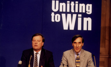
There’s a particularly amusing picture from the 1997 Tory leadership contest of Ken Clarke and John Redwood awkwardly paired up under a blue sign with the words ‘Uniting to Win’ on it. Though their campaign for power was forgettable, uniting to lose against William Hague of all people, they can take solace in being an unlikely pair of trend-setters. Theirs was the first use of a logo and slogan in an internal party contest, the start of a succession of design shockers on the British public ever since. The standard of this year’s leaders’ logos shows a slow decline. Back to basics would be a fine thing.
Most slogans have been comically dire. Iain Duncan Smith’s 2001 effort of some Microsoft Word Art over the top of an image of Westminster – which was supposed to be sunlit, but looked more urine-soaked than anything else – was a particular eyesore. Labour is also guilty: in 2016, Angela Eagle’s logo had all the makings of a high-end sex toy brand. Surely the current crop has learned from the mistakes of leadership logos past? Not a bit.
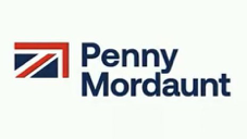
Penny Mordaunt. More than a whiff of a failing nationalised industry here. The combination of ‘serious person’ font and strangely quartered flag means the whole thing looks like a logo for an accountancy firm where the senior partner also spends their weekends taking part in re-enactments of the Battle of Waterloo.
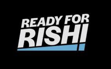
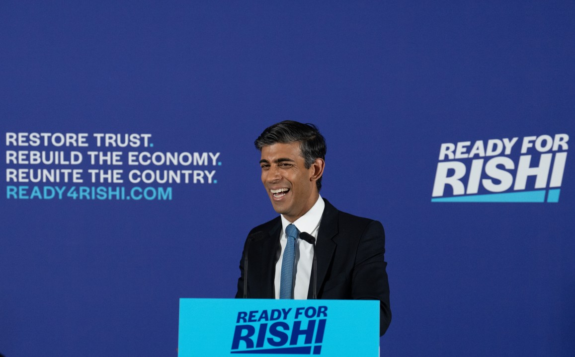
Rishi Sunak. The combining of an ‘i’ with an exclamation mark is the sort of thing which someone, somewhere, presumably thought was very clever, but is, when you actually think about it, patently moronic. As such, Rishi’s branding has ended up looking like a brand of low grade ‘Huel’ substitute or the logo of the first (and so far only) sushi restaurant in a former Soviet satellite state.

Tom Tugendhat. Actually using one’s own face as a logo is – unless you’re Madonna or Kim Jong Un – a decision that might be called brave in political circles. Unfortunately the decision to pair it with that particular slogan means it looks like the opening shot of a television apology by a US Congressman caught cottaging or, if we’re being more generous, promotional material for a UKTV Gold special where Tom goes around offering advice – a la Kim and Aggie – on how to tidy people’s homes.
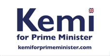
Kemi Badenoch. There is something to be said for keeping things subtle. One might have plenty of very good reasons to doubt the combined intellect of MPs but even they will get the message when over half the characters on your poster are ‘p-r-i-m-e m-i-n-i-s-t-e-r’. More generally the fluoride white background gives it a strangely medical air which, when combined with the hint of the Union flag, looks like the branding of a campaign to get people to buy British sanitation products. Mouthwash from Marple, condoms from Kettering, enema supplies from Enfield. That sort of thing.
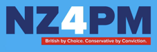
Nadhim Zahawi. The main problem here is that, of course, ‘NZ’ can stand for lots of things. ‘Neutral Zone’ – which might be a statement of Zahawi’s intent after being involved in the Chernobyl of the Johnson resignation. ‘Net Zero’ – about which most of the candidates have been suspiciously quiet. Or ‘New Zealand’ – and, if we’re honest, perhaps the only person demonstrably more appalling than any of the current crop is Jacinda Arden. Anyway, design wise, this looks like the advertising for the afternoon drive time slot on a local radio station which is secretly a front for the government’s ‘Prevent’ programme.
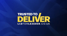
Liz Truss. Leaving aside the fact that the refusal to use obvious puns (‘Truss-ted to De-Liz-er’ etc) suggests this was made by someone devoid of a sense of humour – which I would have thought would be essential if you worked for Liz Truss – this is clearly not a leadership poster at all, but the slogan and branding of a courier firm in the American Mid West that shot to national fame when one of its drivers turned out to be a serial killer.


Comments