The press release blithely informs us that Federico Barocci (1535–1612) is ‘beloved by artists and art historians throughout the ages’, but I must beg to differ. Not by me, nor by any of my considerable range of friends and acquaintances in both fields, has he been loved or even much known. Barocci is one of those artists who has slipped under the general radar, partly, I suspect, because his work often looks like a sweet and sentimentalised version of Raphael. Raphael is a great genius, but there are a number of paintings by him I find hard to take, particularly when he descends to sickly emotionalism. Barocci seems to take this path quite a few steps further, which is probably why my eye has slid quickly across his work, and silently edited him out of my personal pantheon. But this is clearly a mistake, as this substantial exhibition, supported by the Joseph F. McCrindle Foundation, demonstrates. I still don’t like many of his paintings, but the drawings and studies are an absolute revelation.
Barocci was a master of process, not only drawing in pastel and chalk, ink and wash, but also pioneering the oil sketch long before it became an accepted artistic practice. There are more than 65 preparatory drawings and studies in this show, and in nearly every case they outshine the finished works. Room 1 in this Sainsbury Wing exhibition is dominated by a painting of the Immaculate Conception (1574–5) that is certainly full of life and movement but which is too saccharine in colour for my taste. More interesting are the nude studies of the girl modelling for the Virgin Mary, which Barocci made to get the body to look right beneath the robes. He took enormous pains and was nothing if not thorough in his researches. Compare the compositional studies for the ‘Madonna of the Cat’, also in this first room. There’s a dynamic ink and chalk study and then a more finished one in red and black chalk made after the painting was finished, to be sent to Cornelis Cort in Rome as a scale model for an engraving. (A copy of Cort’s print hangs next to it.) The opportunities for comparison afforded by this exhibition are extensive.
When I first stepped into Room 2, I thought ‘The Entombment’ altarpiece (1579-82) was less interesting than the wealth of studies for it (the oil sketches of the heads are truly remarkable), but looking at the sketches brought me back to the painting with renewed appreciation. And as I sat in front of it, I began to recognise its striking originality. Barocci was adept at suggesting movement in his compositions (in this he anticipated the Baroque painters of the following century), while in the figure of the sorrowing Magdalene he created a character of great and compelling humanity. His portrayal of her is almost oblique: she is depicted from the side and back, but she is the anchor, formally and emotionally, of this most affecting painting.
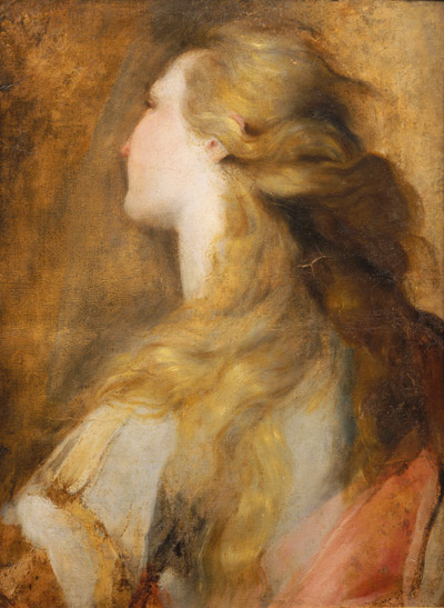
Room 3, apart from an affectionate red and black chalk drawing of a cat, left me unmoved, and the big paintings in the main gallery, Room 4, don’t convince me either. More intriguing is the experimental distemper painting of ‘St Francis Receiving the Stigmata’, ethereal and mysterious, halfway between painting and drawing. The double display of drawings and studies down the centre of the room is infinitely preferable to the finished canvases. These capture both the eye and the heart, particularly a study in pen and brown ink with grey and black oil paint for the ‘Institution of the Eucharist’. Here, too, is a marvellously drawn ‘Head of Anchises’ in chalk and pastel on blue paper. Room 5 contains one painting and a dozen drawings and again I recommend concentrating on the drawings, especially the two oil studies for the head of St Joseph. Room 6 contains three exquisite mixed-media drawings of trees, which anticipate Rubens, and which seem to have been made for the fun of it, rather than as preparatory studies for a painting. The portraits here are disappointing, except for a small unsparing self-portrait that is hauntingly melancholic. Barocci was clearly a man in advance of his time, technically fascinating, who united colour and drawing in original ways.
Meanwhile in Room 1 of the NG’s main building, is a superb display (admission free) that celebrates the oil sketch in its own right. Many of you will I hope remember the breathtakingly beautiful exhibition at the Tate back in 2002, called American Sublime: Landscape Painting in the United States. One of the stars of that show was Frederic Church (1826–1900), renowned for his vast panoramas of wild country, intriguingly lit and dramatically composed. Now we have a small but intense show of Church’s oil sketches. The 19th century was the great age of the plein-air oil sketch and Church, who made hundreds of such studies, is one of the form’s acknowledged masters. A great traveller and compulsive draughtsman, he almost never used watercolour but excelled at the swift oil notation in front of nature. Some were vigorously abbreviated and for his own use, while others were worked up for public exhibition. Many depicted his favourite moments of twilight and sunset and touched upon the numinous: Church achieved a remarkable range of expression without forfeiting spontaneity.
Perhaps the most ambitious of the Hudson River School of landscape painters, Church is represented here by 27 small studies and one large painting — the only big oil by him in Britain: ‘Niagara Falls, from the American Side’ (1867), on loan from the Scottish National Gallery. Next to this impressive painting hangs a painted-over photograph of Niagara, a very modern-looking image, and quite a contrast to the other depictions of the Falls here. The real joy of this exhibition is the directness of the paint handling and its lasting freshness in the oil sketches. Look at the vibrant handling of snow in ‘Winter Twilight from Olana’ or the lovely free paintmarks and rose light in ‘Popocatepetl and Ixtaccihuatl at Sunset’. The paint can be luscious or subtle (note the brilliant detail in ‘Obersee, Germany’), but the subject is rarely without drama. The trio of iceberg studies is particularly good: the central painting with golden light on its topmost tip is magical. And there are a couple of studies of Jamaica that really need to be seen.
Every landscape painter in the country should visit this show — and anyone else who glories in the free and evocative use of oil paint. With this exhibition joining Lichtenstein at the Tate and George Bellows at the Royal Academy, it might with justification be said that we are in for an American Spring — and no bad thing too.


Comments