Giovanni Benedetto Castiglione (1609–64) was, I must admit, unknown to me until I visited this show, the only Castiglione I was properly aware of being the one who wrote The Book of the Courtier published in 1528; clearly not the same man. The artist Castiglione was a tempestuous character, always losing his temper and getting into fights. He tried to throw his sister off a roof and is said to have committed murder; perhaps more importantly for his artistic career, when he was at the height of his popularity in Genoa, he slashed to shreds a painting commissioned for the Doge of Venice, and fled the city in which he was born and trained. He seems to have been self-sabotaging at every opportunity, and there are easy parallels to be found with Caravaggio (1571/2–1610), with whose equally turbulent life he just overlapped. He never achieved the position or popularity he deserved, but in the 18th century his work was rediscovered, and became a particular inspiration to Giambattista Tiepolo. In 1762, George III acquired a group of 250 sheets by Castiglione from which the current exhibition is drawn — the first major show to be devoted to the artist in this country.
There are some 90 prints and drawings on display, and I have to say at once that there are too many, with too little variation. Castiglione is in many ways a fascinating artist: he was the first Italian to discover the etchings of Rembrandt, and in the 1630s he invented the monotype, that ultra-modern-seeming combination of painting and printing put to such great use by Degas. He also made remarkable large oil-on-paper drawings that were not intended as preparatory studies but as finished works in their own right. All these things are of great interest, but because of an injudicious selection of work, their impact is diminished. There are simply too many brown oil drawings in this show. A selection of his oil paintings would have offered contrast and change of pace. Castiglione is presented in this reappraisal entirely as a graphic artist, which was undoubtedly one of his great strengths, but the interested viewer needs to see some of his canvases to get a more rounded view of this intriguing artist.
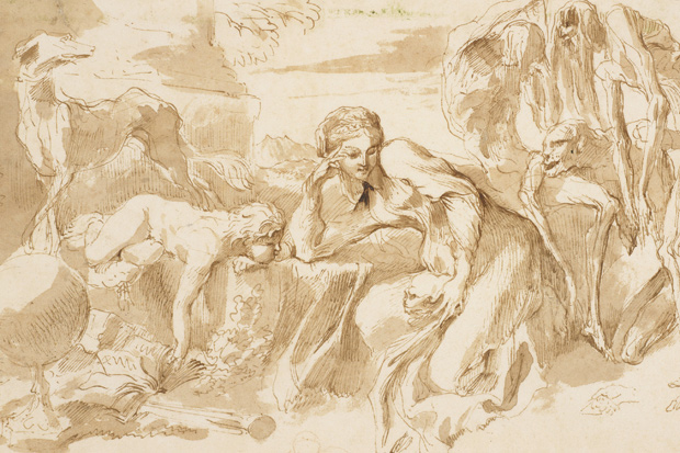
The exhibition is spread through two rooms, and however full of movement and skill, the brown oil drawings grow slightly wearying on the eye. And this is a pity, for at their best they are dramatic and powerful. It comes as a relief to find the occasional vivid pen-and-ink drawing, such as ‘Shepherds with animals’ or ‘Women and children praying before a tomb’. I enjoyed the dynamic copy of Titian’s ‘Sacred and Profane Love’, incorporating blue-grey and red paint along with the brown. A rather beautiful head of a youth in a turban, drawn in red chalk, stands out here, and then a whole series of Rembrandtesque etchings, chief among them a probable self-portrait, given the confrontational look in the sitter’s eye.
Here, too, in this first room, on marvellous blue-draped walls, are monotypes notable for their freedom of mark, such as ‘Temporalis Aeternitas’ (1645), a little like an informal and vivacious woodcut. The etchings, too, are good: there’s a wall of them here, of biblical and classical subjects. ‘The Raising of Lazarus’ and ‘Tobit Burying the Dead’ are particularly fine and inventive examples. As for the oil drawings, Castiglione uses the paint with a linear dexterity reminiscent of crayon, speedy and virtuosic, as in ‘The Israelites in the Wilderness’, or ‘Moses Striking the Rock’, in which the central character looks like a painter with a long-handled brush demonstrating technique to a group of adoring acolytes.
In the second room, with its less alluring green walls, the oil drawings begin to pall. A couple of sheets are displayed front and back, showing how the oil has leached through the paper to give a negative image on the reverse. We are often told that oil will eat paper, but it seems here to have survived rather well; no doubt they made paper better then. But the mode and mood is too similar among these works, and the insufficiencies of drawing (the unconvincing legs of the sheep, the anatomical fudging) become more noticeable. A darker brown study, such as ‘An Allegory in Honour of the Duchess of Mantua’, introduces a different note, and you can see why Tiepolo was interested in him. And a group of wraith-like pen-and-ink drawings in the centre of the room suggests Gothic terror. But for me there was too muchsameness and not enough monotypes.
In the adjacent gallery is displayed a portfolio of works on paper by members of the Royal Academy given to Her Majesty the Queen to celebrate her Diamond Jubilee. These are framed and hung around the walls in what looks like a mini-RA Summer Exhibition, without the interruption of non-RA work. It’s an impressive and fittingly varied tribute to the Queen, the Academy’s current Patron, and includes some fine things: drawings by Allen Jones, Michael Sandle, Anthony Green and Philip Sutton, paintings on paper by Gillian Ayres, Nigel Hall and Mick Rooney, a pastel by Ken Draper, an acrylic and collage by Anthony Whishaw and a monotype by Phillip King.
I was lucky enough to be given a preview of Lowell Libson’s fabulous Gainsborough show before it went off to New York, and so am able to write about it in advance of its short London run. This is an exhibition that anyone interested in British art will want to see, for Gainsborough is one of our greatest artists, yet his drawings remain surprisingly little known. Although there are only a dozen works here, this is the largest selling exhibition of Gainsborough’s drawings for 100 years, and it amply reaffirms that he was one of the greatest European draughtsmen of the 18th century. It’s very odd that drawings are still so undervalued when they often express more of the artist’s personality and genius than paintings.
Gainsborough left more than 1,000 drawings, but he must have edited his output, so consistently high is the quality of what survives. The drawings do present a problem of categorising, however, as few sheets are preparatory studies and few are obviously ‘finished’ for exhibition. He evidently drew for pleasure, creating imagined or ideal landscapes, and then returning again and again to an idea to refine it. He employed a number of standard elements — such as sapling trees, cattle, winding roads or rivers, mountain tracks — and then explored them in different combinations and with different media from chalks to pencil, ink washes and watercolour. Gainsborough said that he aimed for ‘a Variety of lively touches and surprising Effects to make the Heart dance’. The heart certainly dances at this exhibition: highly recommended.


Comments