With the Spending Review less than two hours away, I thought CoffeeHousers might like to be armed with a few graphs that set the scene. What follows is by no means the complete picture of the fiscal landscape, but these are certainly some of most prominent landmarks.
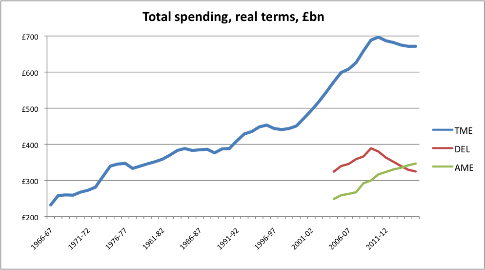
First up, real terms spending (aka Total Managed Expenditure) from 1966 to 2015:

So, yes, all the fuss is about that small dip at the end of the blue line – a dip, as it happens, of about four percent. But don’t think that the fuss is entirely unwarranted. What the government is trying to do here is curb a trend of ever-increasing spending that has persisted over decades, and which rocketed during the New Labour years. In the face of naturally rising social security payments (more or less captured by the green line, Annually Managed Expenditure) and debt interest payments, this has to be done by stemming the cash that departments have to play with. The red line – Departmental Expenditure Limits – is a reflection of the 25 percent cuts that some departments will face.
Indeed, the following graph shows that there hasn’t been a more prolonged period of real terms spending cuts across the period, even if there have been deeper one-off cuts:

If we present spending as a percentage of GDP, then a strikingly different picture emerges:

So, the cuts in the spending review will reduce spending by 8 percentage points of GDP, from 48 percent to 40 percent. On that measure, the state was actually smaller in the early years of New Labour. And there was a steeper drop in the spending/GDP ratio during the Thatcher years, as this graph also shows:

Hovering above all this is our monolithic debt burden. Here’s how that looks in real terms:

Much like the first spending graph, this has shot up during the past decade – but will flatten off during the next five years as the government curtails the borrowing that actually adds to our debt. As the economy grows, this means that our debt will actually decrease as a percentage of GDP:

In the end, the aim of this Spending Review is to tackle the deficit between the government’s incomings and the amount it spends, so that less cash needs to be borrowed. As this final graph shows, the state hasn’t run a surplus since 2000 – in spite of the boom that we were told wouldn’t go bust. On the coalition’s forecasts, this should be pretty much rectified by the end of this Parliament:

Now, to the actual review itself – and the specific cuts that lie under the headline numbers.


Comments