There is a school of thought that sees Paul Klee (1879–1940) as more of a Swiss watchmaker than an artist, his paintings and drawings too perfect, too contrived. Viewing this new exhibition at Tate Modern, one might add that they are also too mannered and precious. I had been looking forward to this show, but going round it I found myself all too frequently impatient and disappointed. Yet Klee is a great modern master, you say; can he be dismissed so easily? Perhaps it is all in the selection of work, for Klee was prolific even though he died young, with a total output of about 10,000 paintings, drawings and works on paper, more than a thousand of which he made in the last year of his life.
Many different interpretations are possible through varying combinations of his work, and perhaps the one offered here is not the most convincing. It is based upon Klee’s own groupings of his work, reuniting pictures long sundered, and perhaps this is the problem. Artists are not always the best judges of their own art. I never thought I would be advocating more curatorial input in a Tate show, but I think an independent selection of Klee’s best work would have been preferable to this academic exercise in recreation.
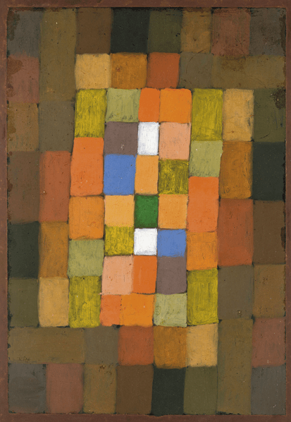
The actual installation of work is thoughtful and sympathetic, consisting of 17 rooms with a few small pictures in each, with plenty of space around them. This should provide ideal viewing but it only serves to emphasise the twiddly and insubstantial aspects of Klee’s imagery. His art so closely approaches writing (line being taken for its famous walk) that his symbols and metaphors are ideograms, mental rather than sensuous images, skeletal rather than fleshly. Although much of his pictorial language is abstract, all too often the lines coalesce into twee little fishes all swimming along together or faces emerging from a beguiling radiance of colour. For colour is one of Klee’s saving graces. As he wrote in 1914: ‘Colour possesses me…Colour and I are one.’
One of the greatest pleasures in this show is the subtlety and unexpectedness of the colour. Things start getting interesting in Room 3 with ‘Green X Above Left’ hung with ‘Familiar Space’, opposite the richer ‘Landscape with Flags’. In these pictures the language is predominantly abstract even if the inspiration derives from the natural world. It seems that Klee could not resist erring towards the fey when he enjoyed a closer encounter with naturalism: look at ‘Remembrance Sheet of a Conception’ and ‘Sunken Landscape’ in Room 4, though these are thankfully countered by ‘Untitled’ opposite, full of strange evocative shapes and surprising colours. But Klee’s sensitive linearity becomes affected even under the technically innovative process of oil transfer drawing (see ‘Memorial to the Kaiser’ in Room 5), in which the line grows interestingly furry, and only the more architectural or abstract compositions (‘Redgreen and Violet-Yellow Rhythms’) suggest real mastery.
When I visited, there was a boy standing in front of the unbearably sentimental deadhead ‘Ghost of a Genius’, drawing a horse in a sketchbook; somehow this seemed appropriate. Klee created some of his best images from his imagination, whether they are stacked town-like structures or impossible paradise gardens. His finest works are imbued with music, like the echoic and vibrant ‘Pottery’ and ‘Suspended Fruit’ (both Room 6), trembling with movement and visual excitement, or the rhythmic structures to be found in Rooms 9 and 10. Here Klee uses repeat lines like geometric contours, or the stylised ripples from a stone dropped into a pond. Perhaps this was the pattern of his thought? Compare the faded-looking ‘Steps’ in Room 11 with the enjoyable and much more painterly textures of ‘Summer House’ in Room 12. Colour can make his forms vibrate (e.g., ‘Looking out of a Cave’) or pulsate through a dense mosaic of pointilliste dabs (‘Memory of a Bird’ in Room 13 is particularly lovely).
If this exhibition presents Klee too often at his most capricious, there are nevertheless paintings here of luminous and compelling authority. Chief among these must be ‘Gaze of Silence’ (in Room 13), from the Menil Collection, which projects not only an interesting division of pictorial space, but also a simplicity of form and serenity of spirit that are spellbinding. More disquieting is ‘Outbreak of Fear III’ in Room 17, an extraordinary form invention and sculptural excavation of shallow space. For surprising colour and freer expression, don’t miss ‘Blue Night’ (Room 16). In memory, I enjoyed more the two previous Klee exhibitions in London: at the Tate in 1989 and at the Hayward in 2002. But perhaps my tastes have simply changed and the twitchy, twittery aspect of Klee’s imagery now comes not as an indication of his wit but only as a revelation of how annoying he can be.
This is the first EY Exhibition in a three-year Tate partnership deal in which EY (formerly known as Ernst & Young) will sponsor various exhibitions at both London branches of the Tate empire. Some artists do not benefit from having their work shown en masse, and look better in mixed survey shows, such as the Pop Art gallimaufry at Christie’s new gallery in Bond Street, recently Haunch of Venison, and rather more distantly Admiral Nelson’s town house. Although mounted by an auctioneer (in partnership with the Cork Street gallery Waddington Custot), this is more of a museum show than a selling exhibition — though I gather that some items are available for purchase.
The exhibition is a treasure trove of choice paintings and sculptures from the early years of British Pop, but too much has been crammed into the gallery’s three floors, so that the hang is more like a country auction than a museum. Nevertheless, the quality of the exhibits is reassuringly high, beginning with Allen Jones and Peter Phillips, Paolozzi collages, Peter Blake’s ‘Tattooed Lady’ and fine things by Hockney and Kitaj. (What a pleasure to see really good work by Hockney.) Billy Apple, a New Zealander who studied at the Royal College in the early 1960s but moved to New York in 1964, is not well known here now, so it’s good to have examples of his witty, deadpan work. Likewise Richard Smith, poet of packaging and more abstract than his peers, is unfairly neglected these days and consequently underrated. (Surely time for a retrospective?) His work looks very good, as does the large group of Allen Jones paintings and the inventive mixed-media drawings of Colin Self. This show, so rich and various it’s difficult to digest, should not be missed.


Comments