With the death of the critic and historian Robert Hughes, a great beacon has gone out in the art world of the West. I take his absence personally, not because I knew the man (I met him only once), but because he was such an invigorating and perceptive guide to excellence. Of course I didn’t agree with everything he said, but he wrote like an angel (possibly a fallen one) and he certainly made you think and even revise your opinions. Although I was aware that he’d been unwell for a long time, I was unprepared for his death at the age of 74, and feel robbed of the books he didn’t write. What happened to the second volume of his memoirs, and what else might he have got around to writing?
Among the various tributes and obituaries I’ve read, the only one to come near the truth of the man was Adam Gopnik’s in the New Yorker. Other commentators stressed Hughes’s combative street-fighter stance, his memorable put-downs, his witty TV persona, his bikes and leather jackets. Only Gopnik talked about his ‘enormous vulnerability’. I witnessed that when I interviewed him in 1996, and I don’t think it was just because he had a hangover. (He probably didn’t.) He was erudite, opinionated, funny and immensely sympathetic. I wanted to talk to him all day, because he didn’t just hold forth but also listened, though I was mostly asking questions. It was this sensitivity, to people and places but especially to art, that made him the brilliant writer he was. I’ll miss that, but at least we have the dozen or so books he did write. And the TV programmes.
One of Hughes’s later crusades was for ‘slow art’, for ‘art that holds time as a vase holds water; art that grows out of modes of perception and making, whose skill and doggedness make you think and feel; an art that isn’t merely sensational or that doesn’t get its message across in ten seconds, that isn’t falsely ironic, that hooks into something deep-running in our natures. In a word, art that is the very opposite of mass media.’ Those sentiments come from a speech given by Hughes at the Royal Academy’s Annual Dinner in 2004, and deserve to be quoted on a regular basis.
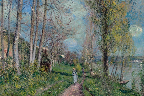
The Academy is developing something of a habit of putting on Impressionists in the summer months, and this year a selection of paintings from the Clark Art Institute in Williamstown, Massachusetts, has been hung to beguile the punters. Although billed as an Impressionist show (fast art in its time, it can lag a little now), it also includes some pre-Impressionist works by Corot, Daumier and Millet, and even post-Impressionist paintings by Bonnard and Gauguin. These tend to be the best things in the exhibition, which is overloaded with sugary Renoirs, though I liked his pot of blowsy peonies in the first room. (His still-life of apples looks as if they’re made of coloured fur or feathers.) There’s a lurid Monet of tulip fields, a couple of decent Pissarros and a fine group of three Corots. A double flat cabinet of invoices and receipts, offering one interpretation of the value of art, was predictably attracting much attention.
Monet’s cliffs at Etretat are always worth a long look, and nearby a Boudin seascape, ‘Boats Returning to Port, Trouville’ (1894), made claims for the quieter kind of picture. Particularly when contrasted with the extraordinary flaming ‘Sunset’ and a rather horrid feathery painting of a bridge, both by Renoir. The genre scenes are sickly stuff mostly, relieved by Bonnard’s ‘Women with a Dog’ (1891), and Tissot’s supremely elegant ‘Chrysanthemums’ (c.1874–6). An end wall of Degas, Manet and Lautrec is more lively and astringent, with a couple of jewelled Boldinis and an interesting Alfred Stevens. (What about a show of his work in England?) The last section, of portraits and the exotic, is distinguished by a very fine Gauguin, ‘Young Christian Girl’ (1894). This alone makes the show worth visiting, with its great controlled splurge of yellow. A group of self-portraits (Renoir looking uncharacteristically Munch-like) ends the show on a high note.
Altogether more exhilarating is the Courtauld’s exhibition of Master Drawings from its own collection, organised in collaboration with the Frick Collection in New York. (The show travels there in October.) Featuring some 60 works spread over three rooms, it’s so full of treasures that I can scarcely even list them. Here we have drawing as it first emerged as an independent art form (‘The Dream’ by Michelangelo, 1533), beside the vital and inventive preliminary sketch (Veronese’s ink studies for ‘Christ Carrying the Cross’, c.1571), and the intimate and private communion (Rubens’s black and red chalk portrait of his young wife, Helena Fourment). We are shown drawings spanning many roles and uses and in a variety of materials, from graphite to watercolour.
The exhibition begins with a very odd Dürer, a brown ink sketch of the Emperors Charlemagne and Sigismund finished in watercolour, presumably a working model for the two panels he painted of them in 1511–13. There are three double-sided pictures on plinths, of which the Carpaccio ‘Virgin’ was for me the most exciting, with all the freshness of first thoughts. An earlier, anonymous drawing from the workshop of Hugo van der Goes, its exquisitely fine lines heightened with white bodycolour on green paper, contrasts piquantly with the broader strokes of a brown ink drawing of the Nativity, attributed to Giovanni Bellini. Some of these drawings are old favourites, such as Michelangelo’s ‘Dream’ and Pontormo’s ‘Seated Youth’, others are hung in telling juxtaposition, such as Rembrandt’s splendid bit of quill and reed pen work, ‘Two men in discussion’, with van Gogh’s ‘Tile Factory’. Also executed with reed pens, van Gogh’s remarkably varied marks are all germane to the construction of the image — none is superfluous or frivolous, though all are full of vitality.
There’s an early landscape of great delicacy by Fra Bartolommeo, and a powerful storm scene on the River Schelde by Pieter Bruegel the Elder. Another Bruegel, ‘Kermis at Hoboken’, makes one long for a big Bruegel show to do justice to this great painter and draughtsman and his supreme skill at pictorial organisation. The second room contains a beautiful Canaletto view towards London Bridge, Giovanni Tiepolo’s forceful lyrical outlines and washes, a Watteau chalk drawing of a satyr pouring wine, a cool architectural Saenredam on blue paper, a sombre Cozens of Rome and an amazing freehand ink drawing of the Louvre by Bernini. In the third room the wonderful conté clarity and richness of Seurat’s nude shimmers out of an apparent chaos of curling lines: a masterpiece of shading and smudging. There’s a mighty but modest Cézanne watercolour still-life, and fabulous things by Francis Towne, Girtin, Gainsborough and Turner. Superlatives fail: see this show.


Comments