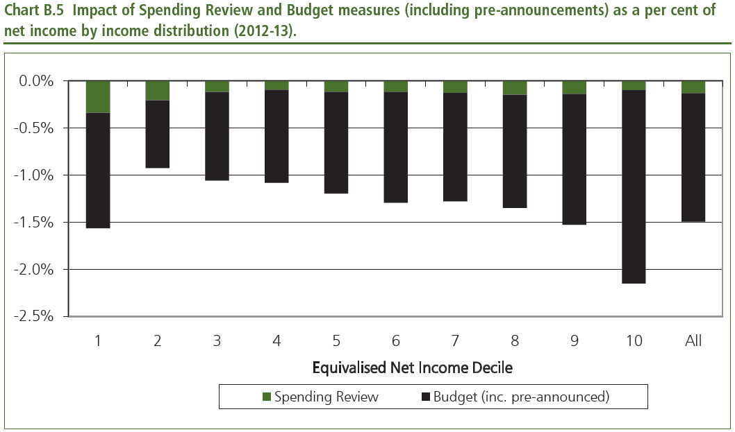

Just as they did in the Budget, the coalition have produced a chart showing the impact of the Spending Review’s tax, spend and benefit measures on different income groups (see above). In many respects, this is a noble effort: it’s a good deal more transparency than Gordon Brown could ever manage in his Budgets. But it also sets a trap for the coalition.
As we’ve pointed out before, these kinds of analyses don’t account for measures that can’t be quantified in terms of the money handed out to, or taken away from, the public. So policies that might improve the life chances of the least well-off, such as better schools or benefit reform, don’t get a look in.
Instead, the coalition’s opponents will focus on the fact that, say, the poorest people are the second most affected income group. And when the IFS produces its own version of this chart, then we can expect the debate over “progressiveness” to flare up once again – just as it did back in August.
UPDATE: As Paul Waugh points out, coalitioneers are highlighting that the lowest income
decile is a different beast to the others. As the Spending Review itself says:
“It should be noted that the bottom decile contains many households with temporarily low incomes, for whom income based analysis, as opposed to expenditure based analysis, may not give an accurate picture of living conditions. In this decile, around 40 percent of households contain an adult that is self employed or a student. While some of these households will have permanently low incomes, many will not. In contrast, in the second decile, only around 20 percent of households contain an adult in one of these groups.”


Comments