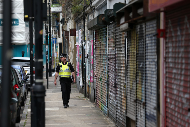
Much fuss is made about financial inequality, but what about inequality of crime? It’s a question that has never been properly answered. Last year, The Spectator put out an appeal for help with social questions that weren’t being addressed by politicians or academia. One was whether the much-lauded fall in crime has been concentrated in richer neighbourhoods. Strangely, the Home Office seems never to have looked into it. It’s an area I know something about, having previously worked on profiling areas across the country based on their inhabitants’ wealth, health, and various other factors for a number of demographic studies. So The Spectator commissioned me to carry out the study.
The crime rate in England and Wales has fallen to its lowest level since the 1980s. Surveyed crime is down by two-thirds on its peak in the mid 1990s, and, although there was a small increase in 2015, crime recorded by the police is down by a fifth over the last ten years, indicating an apparent increase in the quality of life. The crime rate in England and Wales has fallen to its lowest level since the 1980s. Apart from a small increase between 2014 and 2015, the number of crimes recorded by police has continued to fall year on year, indicating an apparent increase in the quality of life. However, as The Spectator suspected in its original challenge, this veneer of success conceals huge inequality in crime rates and the reduction of crime rates between the richest and poorest parts of the country.
I looked at 7,040 neighbourhoods: so-called Medium Super Output Areas (or MSOAs) in England and Wales to compare crime rates and income in recent years. Between 2011 and 2014 alone, crime fell 8 per cent, with the annual crime rate falling in two-thirds of the areas I looked at. Despite this positive trend, there was a great deal of variation in both overall crime rates and the extent to which crime rates had changed between areas. This variation in crime rates turned out to be strongly related to average incomes. The poorest 10 per cent of areas had a crime rate 83 per cent higher than the richest areas between May 2014 and April 2015. Yes, we always suspected that the poor areas have higher crime, but now we can put a figure on it.
More worryingly, between 2011 and 2014, the richest areas saw a 12 per cent reduction in crime rates compared with a reduction of only 3 per cent in the poorest. So the progress has been unevenly distributed: and there is, of course, almost twice as much crime to cut in the poorer areas.
The maps below show how wealth, crime rates, and the reduction in crime rates are spread out across the country (darker colours indicate higher numbers – so higher incomes, higher crime rates, or higher reductions in crime rates depending on the map). The smallness of the areas can make them difficult to interpret, but you can click on the images to see them full size.

Income by MSOAs in England

Crime rate in MSOAs in England in 2014
Reduction in crime rate between 2011 and 2014 by MSOA in England
In order to show these differences more clearly and to compare the very richest and poorest groups, I chopped the areas up into deciles, creating groups from the poorest 10 per cent to the richest 10 per cent. The charts below clearly show the difference in actual crime rate and change in crime rate between rich and poor areas. The difference between the richest and poorest is particularly stark, but the relationship between average incomes and crime rates as well as the relationship between average incomes and the change in crime rate were clear and statistically significant across the range of areas studied. Evidently whatever has caused crime to fall recently has been disproportionately effective in places where wealth is concentrated, leaving people living in poorer neighbourhoods behind. Note on methods: The ONS has freely available records at the MSOA level containing mid-year population from 2012 and average weekly incomes from 2007-8. The police provide street level records of crime in England and Wales that are published monthly and the figures I used cover the period from May 2011 to present. Unfortunately there are no income or wealth records available at a similarly detailed level, partly due to concerns about anonymisation and partly due to the fact that with a smaller sample of households there’s a greater risk of one or two outliers skewing the results. To calculate the annual crime rate by MSOA, I used reference tables from the government’s Neighbourhood Statistics website to match the locations of crimes with MSOAs. I then added up the total number of crimes for each year (starting in May and ending in April). I then divided the number of crimes (multiplied by 1,000) in each MSOA by the population to get the annual crime rate per 1,000 population. To get the reduction in crime, I calculated the percent change between the crime rate for each area in the period 2011-12 and 2014-15. I then repeated the process including excluding ‘antisocial behaviour’. The results I’ve given in this blog exclude antisocial behaviour, but the trends and differences were materially the same whether or not it was included.


Comments