

Gareth Roberts has narrated this article for you to listen to.
Looking for a light, breezy read? If you happened to be browsing the bestseller bookshelves this summer your eye might be drawn to a cover that shows two colourful beach chairs under wafting palms on a bright, sandy shore. The shadows cast by the chairs become those of two children – maybe it’s a story about a holiday romance, a couple who knew each other when they were younger and reunite under the Seychelles sun. If you somehow didn’t know that Stephen King was a horror writer you might not realise that this book, You Like It Darker, is his most recent short story collection.
One of those stories is a sequel to Cujo, King’s 1981 shocker about a family’s amiable dog who gets nipped by a bat and embarks on a rabies rampage. There was no doubt about the genre of Cujo; the cover of its first edition depicted blood dripping from the beast’s slavering jaws.

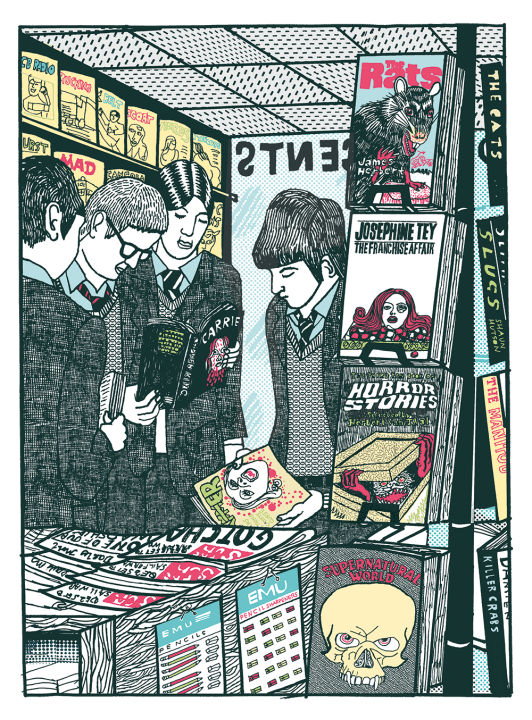
Book covers have become far too bland and far too tasteful, even when the content is blood-spattered offal. When I was a lad in the 1970s, a trip to the horror shelf of a bookshop was a lurid treat. This was before video games and video rentals, just, when some forms of reading could, according to adults, still be bad for you. (It will sound incredible to the young, but grown-ups often tried to stop you reading.) Schlocky thrills were all out on show and were passed from fetid hand to fetid hand in samizdat school libraries. And those covers! Snakes, skulls, brains, breasts, intestinal bits and bobs of all kinds.
The most popular of the lot at my school was James Herbert’s incredibly sanguinary tale The Rats, published by pulp masters New English Library. (Sample line: ‘Mary tried to stir, but she was too weak from blood already lost, the rat now biting deep into her vocal cords.’ And that’s one of the nicer bits.) The original 1974 edition came in an appropriately crimsoned cover – a rodent rearing up for a nasty gnaw. In contrast, the current edition is a ‘clever’ rendering of the title with the outlines of rats cut out of the letters. Boring! Believe me, it’s a mixed-up world where anybody could even contemplate selling The Rats as gracefully restrained.
What is now called ‘crime fiction’ was then found under the section heading of WHODUNNITS or MURDER MYSTERIES, and the covers for these were also gruesomely gaudy. My favourite is Josephine Tey’s The Franchise Affair, in the edition minted in 1971 by Berkeley Medallion, the American equivalent of the NEL. This gripping little story of suspicion in an English village is illustrated by the severed head of Debbie Harry of Blondie (before her pop stardom), with a blackened eye, resting atop an open box of chocolates.
Agatha Christie had a different kind of reputation back then, before either the cosy nostalgic TV adaptations of the 1980s and 1990s or the tedious social justice-infused ones of this century, which are sold as if they contained the meaning of life.
I long for a hook, a twisted nail, some innards. At least a good old skull
The artwork of Tom Adams, who painted the covers for the Fontana editions of Christie throughout the 1960s and 1970s, is twisted, ugly-beautiful and horribly suggestive; a child’s abandoned shoe, pills spilled from an unstoppered bottle and disembodied eyes by the bucketload. But the best of all ghastly Christie covers is slightly later, the 1982 Pan edition of Third Girl: a blond wig, one eye (of course) and some teeth, still attached to their gums, against a blank lemon-yellow face. The current Christie covers? They are elegant, but ordinary; tastefully symbolic rather than visceral. Some of them are similar to the friendly illustration style of twee chick-lit, of the ‘Loveliest Sweetshop In Lollipop Lane’ variety.
True, there are still some inventive twists on crime covers. The Wrong Mother by Charlotte Duckworth and The Boyfriend by Freida McFadden – both corking, very modern thrillers – use blood red objects against bright white backgrounds to cleverly suggest violence. But to visit the crime or horror section of a 2025 bookshop is generally an anodyne experience. You are faced by rows of samey suggestion – lonely roads, farmhouses, landscapes and silhouettes. I long for a hook, a twisted nail, some innards. At least a good old skull.
Skulls were also scattered freely on children’s books. The Usborne compendium Supernatural World (1979) features a particularly nasty one, with a malevolent expression, fangs and glowing red eyes. I compare this with the revolting aspirational ‘role model’ books for the brats of today – Dream Big! I Can Do It! Little People, Big Dreams – and I know which I think is healthier, and which I suspect children would prefer. What self-respecting 11-year-old wouldn’t choose a withered hand emerging from the casing of a grandfather clock over a hagiography of Greta Thunberg? The road-testing of emotions is vitally important for teenage maturation. When the young have been reared on such cutesy goo, we shouldn’t be surprised when, confronted by the everyday horrors of the real world, they react with angsty tantrums and live-streamed meltdowns.
The dullness of modern book covers is partly a result of success. Pulp fiction is more mainstream today, but publishers are worried that mainstream readers are embarrassed about liking it. So it must be made to look like it’s something weightier than the schlock it is. Everything has to be classy.
We no longer have even a residual sense of the elevated and the sacred, but we still need the elevated and the sacred, so meaning is forced into everything else. Attempts are made to add significance to delightful trifles – Tizer disguised as Earl Grey.
You must judge a book by its cover. And looking back over the decades of cover illustration, the pendulum seems to swing between restraint and excess; 1950s covers, though more ingenious than modern ones, are much more similar in tone. We’re due another gaudy, gory phase. Severed fingers, cleavers and gnashing, drooling jaws might return to the bookshelves. I hope so.


Comments