
It’s a rare pleasure to find an unfamiliar artist of the 18th century whose work speaks to the contemporary mind as lucidly as Carlo Labruzzi (1748–1817). I had never heard of him before this show, being still in my playpen when the last Labruzzi exhibition excited the art world in 1960. Although celebrated in his day, he was largely forgotten in the 19th and for most of the 20th century, but it’s clear from this excellent exhibition that he deserves a permanent place in the history books. Not much is known about him beyond the meagre biography that he was born in Rome, the son of a weaver and finisher of velvet, and that his younger brother Pietro was also an artist and became court painter to the King of Poland.
Carlo Labruzzi was commercially successful and achieved not only the recognition of his contemporaries but also popularity among English visitors. (Lord Herbert remarked in 1799 that the three greatest foreign artists working in Rome were Hackert, Batoni and Labruzzi.) That extraordinary Welsh painter of Italian walls, Thomas Jones, knew him. English milords commissioned him to record the Italian sections of their Grand Tours. He painted a few portraits, but he was best known for his landscapes, either done en plein air, or made in the studio from notes on the spot. He was an assured draughtsman, and a watercolourist of distinction. As Sir Timothy Clifford, who has curated this exhibition for Dickinson, observes, we tend not to think of the Italians as masters of watercolour. (Being English, we think the English invented or at the very least commandeered watercolour.) The work of Labruzzi therefore comes as a delightful surprise.
The work in the current exhibition dates mostly from the late 1760s or early 1770s and has been taken from two albums of drawings and watercolours, mostly depicting the buildings and scenery in and around Rome, with several views of Naples and one of Venice. These sheets have never previously been framed or hung, being kept in the protected environment of the albums, and are consequently unfaded and remarkably fresh. I was allowed a preview of the exhibition in Dickinson’s commodious Jermyn Street premises, and liked very much what I was shown. There are echoes of other artists to be discerned — Claude, Salvator Rosa, Canaletto — but Labruzzi has his own style and approach.
The delicacy of his touch is matched by a crispness of delineation, best seen in the pen work, and particularly in the sprigged foliage of the trees. He tended to begin in pencil, then apply a pale Indian ink wash, and finally add the colour; sometimes he used white heightening. One of the most beautiful of these watercolour topographical studies is ‘A View of the River Tiber from the Monte Mario, Rome’ (1779), while the subtleties of ‘A View from the Palatine Hill, Rome, the Alban Hills in the distance’ are panoramic and beguiling. Architecture is well served, particularly in the various versions of the Colosseum, but nowhere better perhaps than in ‘The Temple of Minerva Medica’, done in dark brown wash deliciously heightened with pale cream body colour, a courting couple in the foreground.
For evocative delicacy of pencil work look at ‘The Temples of Vesta and Fortuna Virilis, Rome’, and for overgrown ruins (nature reclaiming man’s encroachment) ‘The Baths of Caracalla’ is hard to beat. ‘Trees in a Landscape, thought to be the gardens of the Villa Borghese’ is very fine and shows what Labruzzi could do with straight landscape. All works are for sale in this enjoyable exhibition, ranging from under £1,500 up to £20,000, with a number of modestly priced works available: a real opportunity for the collector.
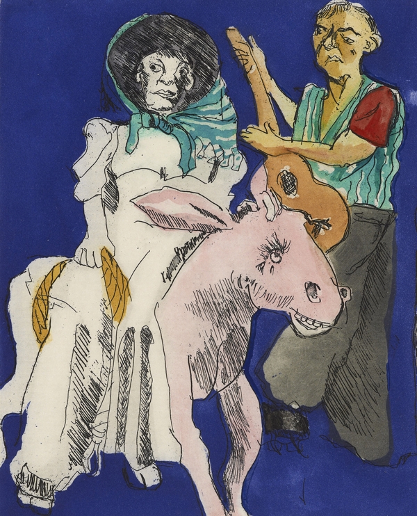
By way of potent contrast, try the current Paula Rego exhibition at Marlborough Fine Art, billed as a celebration of T.G. Rosenthal’s new and expanded edition of his magisterial survey of Rego’s complete graphic work. Originally published in 2003, this second edition contains chapters on five new print series and runs now to 386 pages, an increase of nearly a quarter. With well over 100 new colour illustrations, this sumptuous volume (£75 in hefty hardback) is indispensable for anyone seriously interested in Rego’s work. A limited edition with a choice of two hand-coloured etchings is also available. The exhibition consists of a substantial amount of new graphic work — etchings and lithographs — plus some of the large pastels that Rego does so well, and which occupy a territory all of their own between drawing and painting.
There seems to be something of the deft inventiveness of Rego’s late husband, Victor Willing (1928–88), in her new pastels, particularly discernible in ‘The Psychiatrist’ (2011) and ‘In the Beehive’ (2010). To my eye it’s evident in the handling of materials and the shape-making, and also in the areas of vivid colour and simplification of form. This does not detract in the slightest from Rego’s strength and originality of drawing, nor from her consummate abilities as a storyteller. These qualities come across superbly in her printmaking; her technical mastery of etching and aquatint especially has the incisive edge of the greatest satirists. Rego can be as horrific and bleak as Goya, and there is the same compassion at work too. Her disturbing images pull no punches: death pursues both monkey and maiden, as the vagina dentata grins at the skeleton. Human weakness and savagery have rarely been so thoroughly anatomised.
And finally, last chance to see a splendidly various exhibition of Prunella Clough’s work — paintings, prints, drawings, collages and objects — at Annely Juda. Unusually, there is no catalogue for this exhibition as it coincides with the publication of Frances Spalding’s excellent monograph on Clough (reviewed in March), but it’s a substantial show arranged over two floors.
Clough (1919–99) was an artist of remarkable vision, who saw the world from a very individual angle, first of all painting beach detritus and the cabs of lorries, before moving on to the even less considered and recondite. She would paint a grass plot, a sweet wrapper or a twist of rope in a way that was both inventive and memorable, constantly experimenting with styles and means, printing, expunging and overlaying with imaginative freedom. Her palette varied from the dour to the garish via a very individual range of ice-cream colours, while her line sought out complications and meaning in unexpected places. From the hard-edged to the resolutely organic, her imagery tests the limits of recognition and resolution. A selling exhibition, works start at just £720.


Comments