In this Olympic year, when we feel less guilty than usual about promoting and celebrating all things British, it is appropriate to be lauding our greatest writers. Shakespeare is commemorated at the British Museum, but what about Dickens? Unbelievably, in what is after all the bicentenary of his birth, the Charles Dickens Museum in Doughty Street is closed. Thank goodness the Watts Gallery has had the initiative to mount an exhibition devoted to Dickens’s relationship with art — at least somewhere the spirits of Phiz, Dolly Varden and Little Nell may disport themselves with Olympic pizazz in a museum setting. That is, if you think Little Nell would be up for it…
Dickens is frequently praised for the vividness of his description, indeed for the very visual nature of his writing. He didn’t, however, write much about art, though he numbered many artists (including Wilkie, Maclise, Frith and Landseer) among his friends. Why not? Perhaps he was not as keen on the work of his friends as he was on their personalities, and he did not want to go on record with his true opinions. I suspect that Dickens had rather conventional and unadventurous tastes in painting (he liked watercolours best, it seems, of landscapes and rural scenes, but also owned a nasty sentimental painting by Maclise of a girl collecting water at a waterfall), and perhaps the more avant-garde work of his friends passed him by. Certainly, he is notorious for attacking Millais’s poignant painting ‘Christ in the House of His Parents’, which he clearly loathed, and for heaping mountains of scorn on its innocent dramatis personae.
This painting is duly shown in the first room of the exhibition, with a proof of Dickens’s article castigating it in a cabinet nearby. Also in this room is Frith’s famous portrait of the author, about which Dickens had reservations. ‘It is a little too much (to my way of thinking),’ he wrote, ‘as if my next door neighbour were my deadly foe, uninsured, and I had just received tidings of his house being afire; otherwise very good.’ Dickens has deftly made a story out of the painting, thus defusing it, further smothering it with humour. But then sitters are rarely pleased with their portraits.
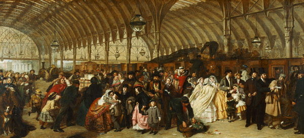
In the main temporary exhibition space on the lower floor, Frith’s ‘Railway Station’ occupies pole position. It is often said how much the style of Dickens’s writing influenced the painting of such great social panoramas, yet there is no record of what Dickens thought of these pictures. Paintings of Modern Life of this sort do not seem to have appealed to him, despite his own social realism. In the last analysis, Dickens’s sensibility has more in common with cinema than with painting, though this did not of course prevent a whole host of images of varying quality being painted of his hugely popular fictional characters. A good selection of them is on show here. Note especially the rich colours of Thomas Faed’s ‘Kate Nickleby’, James Lobley’s ‘Little Nell’, ‘Kit’s Writing Lesson’ by Robert Braithwaite Martineau and a remarkable watercolour scene from ‘Bleak House’ by Sir John Gilbert.
The exhibition is accompanied by a lavishly produced and fascinating book (£17.95 in paperback), with learned essays by various scholars including Nicholas Penny, director of the National Gallery, and Mark Bills, curator of the Watts Gallery. The show takes up only a small portion of the museum’s total exhibition space, and the permanent collection of work by G.F. Watts (1817–1904) may be seen to good advantage in the beautifully renovated galleries. Visitors were plentiful when I was there, indicative of the lasting appeal of this great Victorian master. The Watts Gallery is currently hoping to acquire and restore Limnerslease, the nearby Arts & Crafts studios and home of Watts designed by Sir Ernest George, which would make a glorious adjunct to the existing museum. An Appeal to save the building has been launched and deserves all the support it can get. The Watts Gallery is already one of the best-loved and most enjoyable museums in the country: the addition of Limnerslease would double what it has to offer an already clearly interested public.
And now for something completely different: it sometimes seems that abstract art can be divided between those practitioners who pursue a musical approach and those who take science as their modus operandi. Michael Kidner (1917–2009) favoured the latter course and his preferred reading was The Scientific American, often directly inspirational for his work. His aim was to paint pictures that would appeal to both mind and emotion. He wrote: ‘I want to link things that seem mysterious or not fully understood to things that are less mysterious…to reduce the arbitrariness of description.’ His essentially experimental approach investigated the dynamics of colour and abstract form through rational procedures. He wanted to explore how the eye perceived colour, and his preplanned sequences of parallel bands or waves of colour were some of the first Op Art paintings to be made in Britain.
In 1963 Kidner noted: ‘Optics presents, for me, the challenge that was once offered by perspective.’ Reviewing his work at the time, Norbert Lynton wrote: ‘Optical art is not a system. It is a pictorial language of exceptional clarity. Kidner shows that this language is capable of profoundly poetic content.’ The current exhibition brings together a number of long unseen early paintings, rediscovered in Kidner’s studio after his death, with a luminous group of works on paper made as studies for the paintings. Best to begin upstairs at Flowers with the oil on paper studies, many of which are very beautiful and highly desirable but, since several of my favourites are ‘Untitled’, remain difficult to distinguish. If some of the paintings don’t have quite the same immediacy of impact, they nevertheless provided the artist with greater opportunity to explore what Lynton called ‘sonorous colours in unstable relationships’. Look, for instance, at ‘Violet, Ochre & Blue Stripes’ (c.1963), the lyrical ‘Raindrops’ (1960), ‘Stripes Study for Bill’ (1962) and the beguilingly wavy ‘Blue, Green, Violet and Brown Relief’ (1966). Kidner is still not widely known, but his work, though formally tough, is full of joy.
An excellent example of the abstract painter who leans more towards the disciplines and structures of music is Jeremy Annear (born 1949), currently showing new work at the Campden Gallery in Chipping Campden. His language of pared-down geometric forms, of interlocking lines and expressive textures, of blocks of colour cunningly placed and overlapped, all echo and prompt, is enormously evocative. The contrapuntal structures of these seductive paintings suggest ritualised dances as the linear and spatial interweave to the silent beat of the music of the spheres. Mesmerising.


Comments