Another vast exhibition at Tate Britain, but one which will no doubt prove popular with the public. Watercolour is a national pastime, and the English tend to wax proprietorial about it. As a painting medium it appeals greatly to amateurs because it’s nearly always possible to do something passable in watercolour which couldn’t be achieved in oil paint without more knowledge, application and experience. Passable, yes, but not distinguished: it takes a very great deal of skill to achieve the more than ordinary in watercolour, and herein lies its seduction and challenge. The stakes are raised by the existence of a tradition of great watercolour painting in this country, which prospered with particular insistence in the period 1750 to 1850.
It is often said that the English are adept at watercolour because of the climate — the mild, wet and changeable weather that gives rise to so many wonderful skies and cloud effects. Water calls to water, so to speak. Now along comes this exhibition to ‘reassess the commonly held belief that the medium first flourished during a “golden age” of British watercolour’, to ‘challenge the notion that watercolour is singularly British’ and to ‘overturn such assumptions’ as watercolour being a medium for traditional representational painting, for depicting landscape, the sea and picturesque buildings.
In other words, another example of that curatorial insistence on moving the goalposts in order to invent an argument and something new to write about. Luckily, as with most art-world politics, much of this can be safely ignored, and the average exhibition-goer can enjoy a varied and at times provocative collection of pictures.
The show, which is partly thematically arranged and partly chronological, opens with some marvellous early examples of watercolour in the work of manuscript illuminators and miniature painters. But already we see the ‘opening up’ of the argument to include the medium of tempera (as used in the two earliest manuscripts borrowed from the British Library), which is not strictly speaking watercolour, since its essential quality is its binding, or tempering, with gum or egg. What a treat it would be to see a whole exhibition devoted to tempera, from medieval times to the present, not forgetting the English tempera revival of the first half of the 20th century. One feels rather short-changed to have tempera shoved in with watercolour. Never mind, there are some truly splendid things here, including one of Van Dyck’s studies of a coastal town (perhaps Rye?) — a pity not to have a couple of these very early examples of watercolour landscape — two Wenceslaus Hollar topographical scenes and the haunting Nicholas Hilliard portrait of George Clifford, Earl of Cumberland.
Among the maps and miniatures there is also a pair of memorable Inigo Jones pen-and-ink costume designs for one or other of the masques he was always running up, evocatively tinted with watercolour, and an exquisitely detailed pollard oak at Chichester by John Dunstall, dating from c.1660. Then we move into nature studies, with botanical and geological illustration to the fore, Sarah Stone’s ‘Shells and Coral’ from the 18th century comparing very well with John Fullwood’s 20th-century stones. For some reason, Edward Lear has been sidelined here, with a drawing of a Whiptail Wallaby, when what we really wanted to see were one or two of his remarkable landscapes.
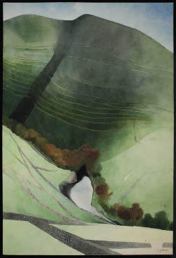
Entering the second large room of the Linbury galleries, the visitor is greeted by a superb Edward Burra landscape of Northumberland from 1972, and chronology gives way to mix and match, which can of course be equally instructive. To the left is a solitary Eric Ravilious painting (why only one example of this quintessential 20th-century practitioner of watercolour?), and beyond is a powerful monochrome ink and wash John Piper of glaciated rocks in Snowdonia, nicely sandwiched between Cotman’s ‘On the Downs’ (c.1835) and Alfred William Hunt’s November rainbow of 1866.
A flat cabinet hereabouts shows off sketchbooks by Turner and Piper. Turner’s famous ‘Blue Rigi’ is in this room, as are Girtin’s equally celebrated ‘White House at Chelsea’ (1800), a Francis Towne which doesn’t really do justice to his originality, and an R.P. Bonington of Verona of some distinction. Next to the Burra there’s an intriguingly textured painting of Kentish hop gardens by an artist unfamiliar to me, Cecil Lawson (1851–1882), and beyond that a cracking Charles Rennie Mackintosh village landscape (c.1927).
Don’t miss the madly detailed Richard Dadd view of Rhodes, hatched and stippled with tiny eye-boggling dabs, and the more lenitive panorama of an Egyptian oasis in the second world war by Edward Bawden. Holman Hunt is here, always worth looking at, and another big Burra, of a Mexican church, one of his crankier interiors.
The next section, dealing with ‘The Exhibition Watercolour’, is rather forced and finished and generally lacking in spontaneity. Nevertheless, there’s a brightly washed 1920s ‘Nativity’ by Dorothy Webster Hawksley, Arthur Melville’s softly atmospheric ‘Blue Night, Venice’ and the vividly intense ‘Streatley Mill’ by George Price Boyce. A ‘How to do it’ section follows, in which technique is explained under the watchful gaze of such masterpieces as Turner’s ‘Scarlet Sunset’ and Whistler’s ‘Beach Scene’. Good to see a large work by Rebecca Salter here, one of our best contemporary practitioners, who is currently enjoying a large survey exhibition at the Yale Center for British Art in Connecticut.
The next theme to be addressed is war, and Burra is given prominence here once again — almost as if the Tate wants to steal the thunder of Pallant House’s forthcoming Burra retrospective (22 October 2011 to 19 February 2012). Luckily, there are a lot of other war artists to choose from, and inevitably Paul Nash and Graham Sutherland feature, with rather a good Sargent, in which the harvest goes on regardless of the crashed aeroplane in the background.
As the show moves towards its end, the mood turns introspective. Under the heading ‘Inner Vision’ are great things by Blake and Paul Nash, rather obvious choices by that underrated master David Jones, perhaps too much Burne-Jones. Good to see a fine Chris LeBrun ziggurat hung between Samuel Palmer’s ‘Hilly Scene’ masterpiece and Rossetti, and I can just about see the point of including Beardsley, but the dreadful Simeon Solomon? And Victor Hugo is fun, but totally out of place.
The contemporary section of unbelievably feeble Tracey Emins and equally insignificant squiggles by Bethan Huws is thankfully enlivened by a series of witty David Austens and an intriguing grid study by Lucy Skaer. In the last room the definition of watercolour is stretched to breaking point with a large acrylic-on-canvas action painting by Sandra Blow. I admire Blow’s work, but it is completely out of context here. Much more appropriate are the two lively and irreverent Roger Hilton gouaches (honouring his centenary) and the sequence of Alexander Cozens blot studies from the 18th century. On the opposite wall is a fabulous group of Turners — ten watercolours, mostly beginnings of things featuring sea and sky, culminating in the radically minimal ‘Boat at Sea’. Better to draw a veil over the contemporary offerings at the far end of the gallery, though these are somewhat redeemed by Callum Innes’s delicately beautiful layered washes.
In sum, it’s an odd selection, but though that can be more stimulating than a predictable one, there are one or two glaring omissions I cannot overlook. Constable, Linnel l and Wilson Steer are incredibly absent. Among the moderns where are Frances Hodgkins, John Nash, Josef Herman, Elizabeth Blackadder, Norman Adams and Henry Moore? I would have included examples of the masterly figurative-to-abstract compositions of Alan Reynolds from the 1950s and early 60s. Reynolds is criminally undervalued in the unbalanced art world of today, though next week I hope to write about him at some length. As for Watercolour at the Tate — it’s a show to enjoy selectively. Whether it’s worth a hefty £12 admission fee when nearly half of the exhibits come from the Tate’s own collection (and thus should be free) remains open to debate.


Comments