

The Brown Bust: house prices
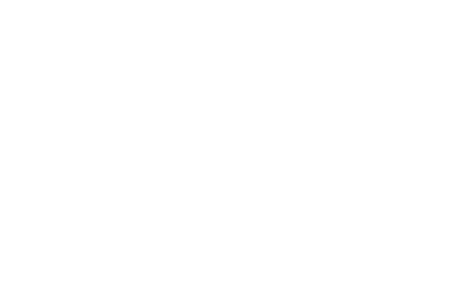
This is the first in a short series on the illustrated Brown Bust, we’ll show you graphs looking at the various aspects of the bursting of the Brown Bubble. After failing to control monetary policy – giving the Bank of England an inflation-only remit – the out-of-control money supply led (as it always does) to an asset bubble which has now burst. This graph shows how spectacularly. In little over a year, UK houses have fallen by 14 per cent – more than they did in six years under the Tories. Both lines are rebased to 100, with 100 being the peak of the market and months along the bottom. It’s already the sharpest house price fall in 70 years, and Citi – who produced this graph – estimate we’re not even halfway to the bottom. Their base case is a 30 percent drop. Given how much household debt is secured against plunging house prices, this will have a serious effect on the real economy.


Comments