
I find it easy to forget that Piet Mondrian is a Dutch artist. The linear, gridlocked works he is famed for seem to beat with the energy of the New York metropolis. But it was not always so. His path to abstraction was a precarious one that bumped into a number of styles drifting round during the early 20th century. And, in the beginning, his work was Dutch — pastoral, domestic, earthy.
To see this progression, head to Margate (Margate!) where you will find an exhibition of Mondrian’s work at Turner Contemporary, which commemorates the 70th anniversary of his death. The title sounds generic — Mondrian and Colour (artist — tick! Artistic property — tick!) — but in many ways, it’s confusing. After all, Mondrian is hardly known for his broad range of colours. In his celebrated neo-plastic works, he practically avoids all pigments, focusing only on the primary colours, and boxing them in with black and white. Even before, it is reserved. His paintbrush rarely dips into green.
The emphasis here is on the 25 years that led up to his breakthrough with the grid paintings in 1919. After this point, he settled into abstraction, and built a lifestyle around it. His prominent position in the avant-garde is determined by this earlier stage but, truth be told, few of his works from that period are that remarkable. It is what they led to that is astonishing.
What is Mondrian’s relationship with colour? It is always restrained, even when it is bright. He liberated colour from its traditional role of creating shade and volume, and gave it a plastic quality. Exposure to theosophy led him to explore the idea that absolute laws rule the universe, and his paintings became meditations on this philosophy. The curators may have chosen a banal title, but it obscures what is in fact an erudite exhibition.
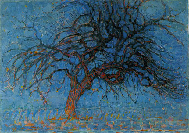
In his early works, Mondrian’s schooling as a Dutch landscape painter is noticeable, with the focus on bucolic motifs: windmills, farmhouses, apple trees. Brown is the dominant colour, with daubs of purple and mustard yellow. As new artistic styles breeze through, he harvests their developments. He absorbs the intense hues of the Fauves and the Expressionists (‘Devotion’ could easily be confused for a work by Edvard Munch), and studies the colour theories proposed by Goethe. Pointillist patterns then emerge, and soon the brown disappears. Works like ‘Zeeland Farmer’ and ‘The Red Mill’ are drenched in cobalt blues and blazing reds.
Later, he succumbs to the advances made by Picasso and Braque; brown reappears in his ‘Self Portrait’, and Cubism’s geometry takes hold. It provides Mondrian with a way to segment objects, and in successive works he reduces the graphic details down to black lines, and segregates colour into planes. By 1919, the first grid appears, and soon, the red, yellow and blue rectangles.
Really, this is the first chapter of a retrospective. It highlights how Mondrian used colour as a springboard for his philosophical explorations, and charts the steps he took towards abstraction. Walk through the exhibition, then reverse back through it, and marvel at how something so unique could come from such muddy origins.
Each step is vital, that’s clear, but in the individual periods, Mondrian rarely shines. You can understand why he embraced the De Stijl movement once he reached it — he pioneered it, and he excelled at it. It is slightly disappointing to reach this breakthrough moment, and find only a handful of grid paintings; after you’ve passed through the weak versions of notable art movements, you hope for the fanfare. Fortunately, another show at Tate Liverpool picks up where this one drops you. Mondrian and his Studios runs until 5 October, and includes many of his most familiar works.
Back in London, I dug out a book on the Dutch Golden Age. And there, in the work of Johannes Vermeer and Pieter de Hooch, I began to notice Mondrian’s Dutch heritage. The distinct vertical and horizontal scaffold on the canvas. The restraint. The clear aesthetic language. The primary colours, set amid the brown. Almost no green. Yes, Mondrian is Dutch after all. But it took a trip down to Margate to see it.


Comments