There are so many good exhibitions at the moment in the commercial sector that the dedicated gallery-goer can easily spend a day viewing top-quality work without paying a single museum admission fee. The following shows nicely complement some of the current or recent displays in public galleries — such as Mondrian||Nicholson at the Courtauld and the Tate’s Picasso and Modern British Art. Despite the financial squeeze and such new burdens as the bureaucratic nightmare of Artists’ Resale Right, commercial galleries continue to play an extremely important role in the nation’s artistic life, though they are not given much credit for it.
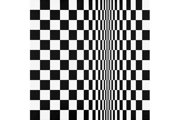
Typical of the museum-quality exhibitions now mounted with increasing frequency by the more resourceful gallerists is Bridget Riley: Works 1960–66. A joint venture between Riley’s long-time dealer Karsten Schubert and James Holland-Hibbert, this exceptional exhibition is split between two West End venues, so be sure not to miss one or the other. Riley, who celebrated her 80th birthday last year and continues to work with unceasing invention and unabated rigour, first came to prominence in the 1960s with her extraordinary black-and-white optical paintings. This is the first exhibition to concentrate exclusively on the b&w works, and brings together paintings from public and private collections, previously unseen gouache studies from the artist’s studio, and the complete prints, making some 46 items in all. Some images will be more familiar than others, but it’s fascinating to see such unknown works as the circle and square gouaches from 1960 alongside classic Op Art paintings like ‘Climax’ and ‘Crest’.
Although initially these paintings were entirely restricted to black and white emulsion paint, the geometrical arrangements of their patterns exert such strange and powerful effects on the eyes that we start to see not only movement but also colour. (Interestingly this doesn’t happen to anything like the same degree with the studies, which implies that it’s something to do with the reflective properties of paint sitting on the surface of board, compared with ink or gouache sinking into paper.) The wheeled zigzag spokes of ‘Blaze 4’ are particularly effective in this department: all is pulsing energy and vibration, and not just grey but yellow, blue and green and even a suggestion of orange emerge, too. Yet these paintings, which look so mathematical in their structures, are intuitively arrived at, through fruitful oppositions of agitation and repose. Fifty years on, they are still surprising, still beautiful, still disturbing.
A very different artist, but no less exciting to look at, is Ivon Hitchens (1893–1979). A Modernist who rejected the urban directives of the movement, Hitchens spent his life researching the Romantic tradition of British landscape through a formalist vision of abstracted paintmarks. His favoured format was the extended horizontal canvas, on which he marked out his territory (both landscape and paint-scape) with great lateral sweeps of paint, punctuated by the upright accents of trees. His lyrical colour and superb phrasing make his best paintings a deep joy to look at, but there has always been a slightly hit-and-miss quality to his work which seemed to go with the spontaneity of his working methods. New research suggests that Hitchens in fact planned out every painting in detail, which interestingly enough brings his approach more in line with Bridget Riley’s. But will this make us look differently at his pictures? The colours haven’t stopped singing, and in such paintings as ‘Nude, Sizewell’ (c.1935) and ‘Moatlands’ (c.1937), appearances and formal paint application co-exist and enhance each other wonderfully. A treat.
Ben Nicholson (1894–1982) has been a favourite artist of mine for more than 30 years, so an exhibition of his paintings, reliefs and drawings that combines smaller works with very substantial statements — as the Bernard Jacobson show does — is bound to appeal. This is a large exhibition on both floors of the gallery, and includes some very good material, but I came away wishing it had been a smaller, more focused display. Somehow the extent of the exhibition rather diminished the artist, and it even ended up looking like ‘101 ways with a piece of left-over hardboard’, despite the pencilled mug handles and evocative outlines.
That said, the exhibition is worth visiting for its best works, which include, principally, ‘October 1958 (Brown Goblet)’, ‘October 1951 (St Ives, Steeple and Ship)’ and ‘May 1955 (Italian Wall)’ — the last for some exquisite touches of colour. Also ‘Nov 1960 (Anne)’ and ‘The Ducal Palace of Urbino (Palazzo Ducale Urbino)’, a wondrous pencil and oil wash drawing. It’s the superbly judged combination of restricted colour, essential outline and shading that is so compelling. Downstairs, there’s a lovely watercolour and pencil drawing of Rievaulx Abbey, ‘1968 (Mountain Landscape)’ in pencil, crayon and oil wash over an etched base, and the sizeable and serenely rhythmical relief ‘Rock Landscape’ (1971–5). I also liked ‘Dec 61 (Greek and Two Circles)’, oil and pencil on carved and incised gessoed board. In the end, that’s what Nicholson was best at: balancing forms and texturing surfaces. The show is accompanied by a handy little catalogue reprinting Christopher Neve’s excellent 1993 essay.
Kazimierz Zielenkiewicz (1906–88), better known as Caziel, was a Polish painter who settled in France and became involved with the heated debates and stylistic digressions of Modernism. He showed with many of the great names of the period and enjoyed a close friendship with Picasso, at its peak between 1947 and 1951. Around that time he exhibited at the avant-garde Salon de Mai, alongside Picasso, Vasarely, Hartung and Manessier. In 1957 he married the Scottish painter Catherine Sinclair, and in the late-1960s he moved to England, living in Somerset for his remaining years. Whitford Fine Art has handled his estate since 1994, and is now showing his abstracts from the period when he was so friendly with Picasso.
They range from geometric to biomorphic imagery, and although they don’t remotely resemble Picasso’s work, these powerful images do strike up an intense dialogue with the more famous master. Caziel’s paintings look both fresh and strong in this exhibition: witty and inventive and colourful. He was without doubt activated by a belief that radical artists were researching a higher order of reality, but that idealism only served to irradiate his work with optimism. There is joyfulness to his shape-invention and the arrangement of his colours against a dark ground. Even the powerful charcoal drawings have an independent presence that reaches beyond the merely physical. Recommended.


Comments