Leighton House, studio-home of Frederic, Lord Leighton (1830–96), is one of my favourite museums, and always a treat to visit.
Leighton House, studio-home of Frederic, Lord Leighton (1830–96), is one of my favourite museums, and always a treat to visit. This small but informative exhibition about the architect George Aitchison (1825–1910) who built it is a well-timed adjunct to the V&A’s great survey of the Aesthetic Movement, in which he is also included. Leighton House is Aitchison’s monument, for there are few other buildings to his name, apart from imposing warehouses; certainly no churches or country houses.
He built warehouses because he needed to earn a living and was fortunate enough to inherit his father’s post of architect to St Katharine Dock near Tower Bridge (father and son co-designed Ivory House). But Aitchison was no mere cobbler-together of other men’s ideas, and was innovative in his use of an iron skeleton in another Wapping warehouse he built. His studies in Italy (where he met Leighton, who became a good friend) confirmed his love of classical architecture, but also a Renaissance-inspired passion for colour, texture and pattern. These were the qualities which were to distinguish his mature work.
Aitchison regarded himself as an ‘art-architect’, a classification which puts art rather than architecture at the apex of the crafts, and this can be seen in the exquisite watercolours of interior designs he made for exhibition at the Royal Academy. (He was an Academy stalwart, studying there as a student, showing regularly in the Summer Exhibition and returning as professor of architecture, 1887–1905.) The coloured drawings he exhibited were not preparatory or working studies but highly wrought works of art, made presumably for their own sake, and only incidentally as a potent advertisement for his interior-design skills. As Daniel Robbins, the curator responsible for Leighton House, writes in the useful catalogue (paperback, £12), Aitchison’s beautifully painted pictures are ‘widely regarded to be amongst the finest architectural drawings made during the 19th century’.
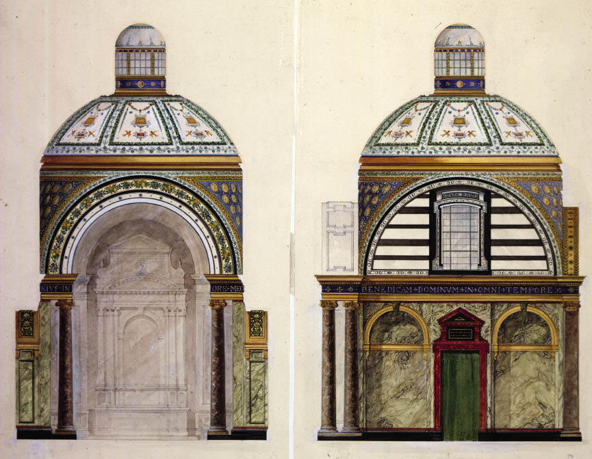
The exhibition focuses on these interiors, mostly commissions in Mayfair, Belgravia and Kensington which came about through the Leighton connection. The visitor is greeted in the upstairs gallery by Alma-Tadema’s portrait of the architect as genial old buffer. Hung high at each end of this small but nicely proportioned room are two friezes in oil on canvas by Leighton, originally painted for the drawing room Aitchison designed for 1 South Audley Street, Mayfair. Called ‘The Dance’ and ‘Music’, Matisse they ain’t, but rather statuesque figure groups as much about interval as performance. Around the warm brown walls at eye-level are hung more than 20 of Aitchison’s interiors, including one from his Italian travels describing the lower church of St Francis at Assisi.
This jewel-like show would glitter more if the lighting levels were raised a bit, but of course these works are extremely light-sensitive, and as they are so lovely it would be a disaster if they faded. So they glimmer instead. Look, for instance, at the beautiful piquant blues in ‘Design for interior decoration of Miss Lehmann’s boudoir’ (1873), or the deeper blues with flowering stylised reeds and storks of the staircase at 1 Grosvenor Crescent. There are alternative designs for the Audley Street drawing room — without Leighton’s paintings, featuring instead friezes by one of his protégés, W.E.F. Britten — and grand bedroom designs for Lythe Hill in Surrey. Finally come Aitchison’s richly ornamented design (almost quilted in effect) for a reconstruction of the Tepidarium in the Baths of Caracalla, and two sumptuous drawings for the interior of the Chapel of St Joseph, Brompton Oratory, very like Leighton’s celebrated Arab Hall. Which returns us to the house, and another chance to wander round its delightfully varied spaces, thinking anew of the brilliance of its architect. Wall panels in a vestibule to the exhibition guide the visitor through the building’s design and construction. Recommended.
The Goldsmiths’ Company Summer Exhibition is devoted to a dozen contemporary craftsmen working in silver. In a couple of rooms on the first floor of Goldsmiths’ Hall in the City, their varied work is succinctly laid out, with a flat cabinet and a tall display case allotted to each. The exhibition is as much about how applied artists get their ideas as about the vessels they produce. To this end, the flat cabinets are given over to the actual process of designing, and contain drawings, models and all kinds of reference material that has influenced or inspired these makers. The result is a fascinating and revealing examination of contemporary silver.
Michael Rowe’s display informs us that the British inch was defined by statute in 1324 as ‘three grains of barley, dry and round, placed end to end, lengthwise’. Although this country has allowed this brilliant unit of measuring to be superseded by some ghastly European metric system that nobody I know either likes or wants, the glorious inch is still in use in the shoe industry (as well as in the Lambirth household). This encourages Mr Rowe to place a hand-made leather shoe in his display and to make much play with barleycorn textural decoration in his journey towards making a silver Ryvita holder.
Lucian Taylor makes ‘skeuomorphic’ pieces, flexible membranes inflated to make spheres like fruit or seedpods. Hector Miller’s cabinet of models and preparatory drawings leads to rather over-elaborate jugs with handles like wizards’ hats. Grant McCaig has made two groups of vertically pleated and seamed carafes, with cups and beakers, which refer (among other things) to the way a human body looks under the ribbed shadows cast by Venetian blinds. His beautifully made vessels have all the impact of a still-life by Morandi.
Theresa Nguyen uses flower and leaf forms to symbolise the spirit, lightly but dramatically evoked in silver, curling and twining as an expression of longevity or the life force. David Clarke is determinedly jokey and subversive, offering us spoons with attitude, or rather volume. He has made a ladle that extends into a tea urn, a spoon like a bloated hanging disc, another that extends sideways more than a foot (that’s 12 inches) into a trough. I hate to think of his feeding habits.
In the second room, Vladimir Böhm does his best to disguise silver as lead or enamel, which makes a basic miserabilist point of denial but leaves one wanting more. Much more rewarding are Alistair McCallum’s wood grain metal techniques, which produce patterns like marbling through a combination of silver and gilding metal. I found Peter Musson’s computer-controlled milling a bit too regimented, but Sarah Denny’s bold and bulbous hammered bell shapes were a sensuous pleasure.
Rebecca de Quin claimed the inspiration of Morandi and Ben Nicholson but was striving too much after effect in comparison with the seemingly effortless Grant McCaig, while Toby Russell, a swimmer and surfer, sought to bring his enjoyment of waves to the prose of a jug. His twisting forms, which at best ripple and undulate prettily, don’t however achieve anything particularly inventive or satisfying. So out of 12 exhibitors, only three are to my eye outstanding: Sarah Denny, Grant McCaig and Alistair McCallum. But go along and make up your own mind.


Comments