On both sides of the Atlantic there are still heated debates about who invented Pop Art, the Americans or the British, but it seems much more probable that concurrently each initiated their own brand in response to the zeitgeist of post-war consumerism. Certainly, the American Roy Lichtenstein (1923–97), after near-abstract beginnings, started in 1961 to paint large freehand versions of comic-strip frames, complete with speech bubbles, and exhibited them in New York in the first Pop Art shows. He moved on a bit from comic strips to Disney, advertising and the ordinary objects of the modern environment, and developed a style of measured drawing and stencils that broke up colour into what looked like the Ben-Day dots of mechanical reproduction familiar from newspapers.
Thus he formalised his images on a grand scale, rendering the banal horribly monumental. Dots and bold outlines on flat images became his signature, and were endlessly repeated. In effect, he became a prisoner of his manner, weighed down with all that superficiality, and never quite managed to crawl out from under the burden. The various slight changes in style and content in this vast exhibition indicate that from time to time he tried unsuccessfully to free himself, and in the process made some of his most interesting work.
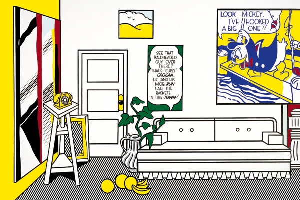
One of the other subjects that Lichtenstein enjoyed painting in his precise deadpan style was great big splashy brushstrokes — the sort of thing you might find on Abstract Expressionist canvases. The Tate’s exhibition, Lichtenstein: A Retrospective, starts here, with a room of three of these dot-bound semi-abstract images, powerful enough in their own way, and no doubt intended (by the curators) to emphasise the fact that Lichtenstein is a great painter. Actually, he’s more effective as an image-maker (the image being more important than the paint — a fine distinction), which emerges as you wander through the rooms, greeting old friends like Mickey Mouse and Donald Duck, and the famous explosions — whether rendered in oil on canvas or enamel on steel — together with the heart-throb comic-book guys ’n’ dolls. (Oh, Brad, Oh, Jeff!) More interesting are the single objects enlarged, like the sponge or aerosol spray, or the double take of the trashcan. Lichtenstein was particularly good at black and white images (an urge towards minimalism was apparent early on), and a room of such things as a golf ball or tyre, jewels or ball of twine still look impressive, as does the relief ‘Portable Radio’ (1962).
Lichtenstein moved frequently between two and three dimensions, making ceramics and wall pieces and free-standing (though still rather flat) sculptures; the brass Art Deco-ish nightclub sculpture in room 6 is a particularly nasty example. Less expected are his landscapes and seascapes, of which I particularly liked ‘Sunset’ and the large ‘White Cloud’ (both 1964). Inclusion at strategic points of Lichtenstein’s drawings varies the pace of the show and offers welcome distraction and even enjoyment. In his studies for pictures he was less bound by the self-imposed rules of style and could experiment more. He was obviously tempted from time to time by ‘real’ painting and let rip with the painterly brushstrokes he usually denied himself, but all too soon he wriggled back into the straitjacket. Somewhat inevitably, a little of Lichtenstein goes a long way, and this overblown exhibition does him no favours, however ingenious he gets with subjects — presumably to keep himself (if not us) amused.
Among the best things here are the 20ft-long ‘Entablature #8’, the group of oval and round mirrors, the huge bed in ‘Interior with Waterlilies’ (1991), the early abstractions in Room 12 and the late landscapes in the Chinese style. I know that some visitors found the latter very moving, and it’s always good to see an elderly artist breaking new ground, but the mixture of styles (dots, wispy atmosphere, hard-edged detail) doesn’t really cohere. I much preferred Room 12 where brushy abstractions from the late 1950s were cleverly hung with Brushstroke Abstractions and Still Life paintings from 1996. But I’ve no doubt the exhibition will be immensely popular: Lichtenstein doesn’t demand a lot from his viewers and it’s easy enough to graze through even 13 galleries of his work without getting up too much of a mental sweat. The show tours to the Centre Pompidou in Paris (3 July to 4 November), if you miss it here and think it worth pursuing.
Looking at such a superabundance of Lichtenstein makes me impatient for a full-scale retrospective of his English counterpart Patrick Caulfield (1936–2005), an artist of far greater subtlety and wit. Caulfield was often compared to Lichtenstein because of his trademark black outlines, but he never relied on the dots as the American did, and in fact created a much more intriguing and diverse body of work. Caulfield rarely exhibited abroad and never received the international acclaim Lichtenstein so effortlessly fielded, but his immaculate paintings and prints offer a deeper resonance and a more complex emotional charge. An ironist beyond compare, Caulfield never really belonged to the Pop Art camp, though he showed often enough with the Popsters and is usually associated with them.
Another artist who emerged to public acclaim from under the Americanised Pop umbrella is Joe Tilson (born 1928). But Tilson, like Caulfield, has always had a more European sensibility, in his case focused around a long-standing and intensely fruitful love affair with Italy. He first visited the country in 1949, met his future wife Jos in Rome in 1955, and married her in Venice in 1956. Although based in London now, he maintains studios in both Tuscany and Venice, and his work reflects a deep involvement with the landscape and cultural traditions of his second home. Tilson’s first one-man show was with the Marlborough Gallery in London in 1962, and half a century later he has returned to the fold with an exhibition, Joe Tilson: A Survey, which reflects the development of his thought and imagery. The earliest work is a figurative painting from 1956 called ‘Pigeons, Piazza S Marco’, moving on to some geometric and Pop-inflected 1960s reliefs.
Tilson trained as a carpenter and joiner in his teens and has always enjoyed the actual making of his work, frequently using wood in compartmented relief constructions. He swiftly grew dissatisfied with the illusion of progress afforded by technology and the consumer society and turned away from Pop to a more profound investigation of the human condition. He has spoken of art as ‘a symbolic discourse…a tool of understanding, an instrument of transformation to put yourself in harmony with the world and with life.’ His most recent work involves a series of diptychs called ‘The Stones of Venice’, which evocatively juxtapose paintings of geometrical floor patterns with façades of churches. It all seems a far cry from the comics of Roy Lichtenstein, and much more culturally nourishing: recommended.


Comments